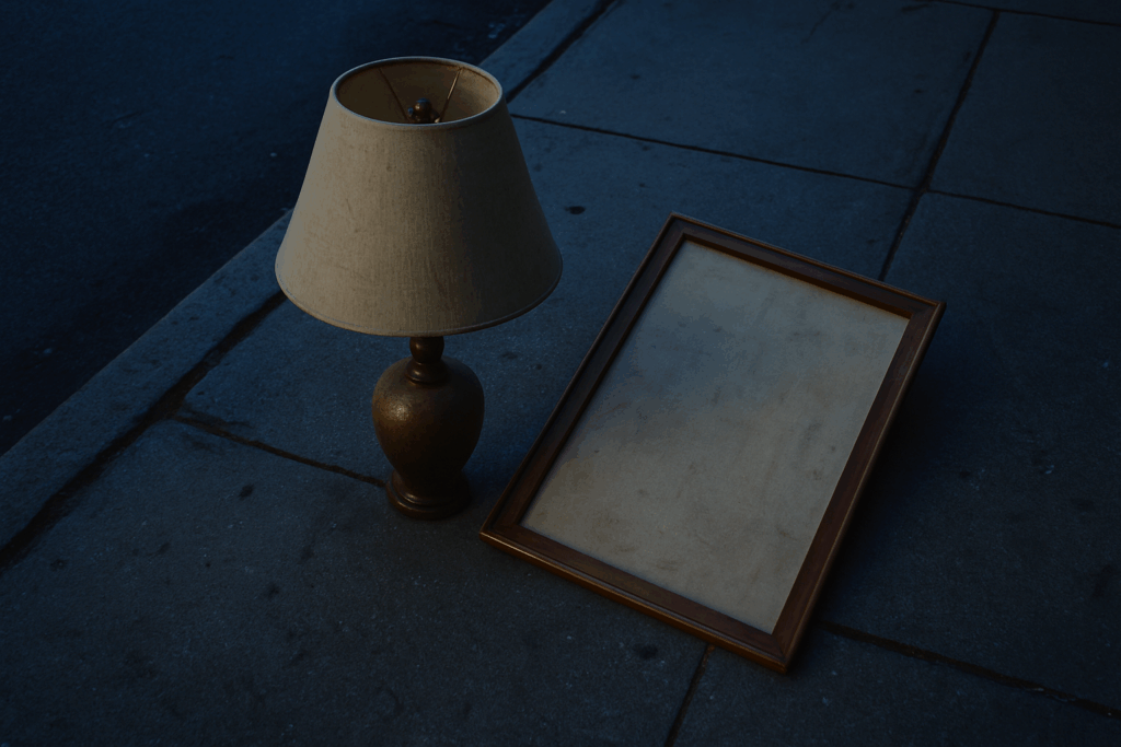
Hanging Art at the Right Height
One of the most common decorating mistakes? Hanging artwork at the wrong height. When art is too high, too low, or isolated on a large wall, it disrupts the visual balance of a room.
Common Issues:
- Too High: Artwork that’s closer to the ceiling than eye level feels disconnected.
- Too Low: Placing frames too close to furniture or the floor can make the room feel cramped.
- Too Small for the Wall: A single small piece on a broad wall lacks impact and can look lost.
The Simple Fix
Use the eye-level rule as your guide. Most designers recommend placing the center of the artwork between 57 to 60 inches from the floor. This aligns with the average human eye line and creates a more cohesive look in the space.
Grouping for Greater Impact
If you have smaller pieces or a large empty wall to fill, think in terms of groupings:
- Gallery Walls: Combine multiple pieces with consistent spacing to form a larger visual presentation.
- Pairs or Trios: Group similar-sized frames vertically or horizontally for symmetry.
- Use of Negative Space: Let your art breathe. Grouped pieces don’t need to cover the entire wall, but they should feel intentionally arranged.
Hanging art correctly enhances not only the individual piece but the room’s entire composition.
Picking the right furniture size is make-or-break for any room. Too big, and the space feels cramped and heavy. Too small, and it ends up looking awkward and unfinished. Misfitting furniture throws off flow, scale, and the sense of proportion—basically, everything your room is trying to get right.
The good news is there are simple ways to dodge that mistake. Start by knowing your measurements. Always. Then remember this: leave room to move. At least 18 inches between a sofa and a coffee table. Around 30 inches for a walkway. Dining chairs need about 36 inches behind them to pull out easily.
Want to see how things will actually fit before busting out the credit card? Use painter’s tape to map out furniture footprints on the floor. Or stack cardboard boxes to get a quick 3D mock-up. There are also free room planners online that let you drag and drop pieces around on a digital layout.
A bit of prep goes a long way. Guesswork never looks good in the final design.
Relying on a single overhead light is one of the most common lighting mistakes. It flattens a room, casts harsh shadows, and generally kills any sense of depth or warmth. It might technically light the space, but it doesn’t make it feel good to be in.
Smart vloggers and designers know that good lighting needs layers. Ambient lighting fills the room with general light. Task lighting helps with specific activities like filming, reading, or prepping gear. Accent lighting adds visual interest and draws attention to key elements in the frame.
The fix is simple but powerful: create a balanced combo of all three types. It doesn’t have to be expensive. A floor lamp, a few LEDs, and maybe a dimmer switch go a long way. Layered lighting turns any space into something that feels real, lived-in, and camera-ready.
A rug that’s too small throws off the entire flow of a room. It makes furniture float awkwardly and turns what could be a cozy setup into a scattered mess. The fix is simple. Make sure your rug is big enough so at least the front legs of your furniture sit on it. This anchors the layout and creates a more grounded, intentional look. Whether it’s a couch, chairs, or a coffee table, partial overlap brings visual cohesion. Rooms feel more connected, and space feels better used.
Test Paint in Real Lighting Before Committing
The Mistake: Skipping a Lighting Check
One of the most common painting mistakes is choosing a paint color based solely on how it looks in a store or online sample. Without testing it in your actual space, you risk ending up with a shade that looks completely different under your home’s lighting.
- Store lighting is often cooler or brighter than residential lighting
- Screens can distort the true color of digital paint swatches
- Natural light changes throughout the day, affecting how color appears
What to Do Instead
To make sure your paint looks the way you expect it to, take the time to test it under real-life conditions.
Try these steps:
- Pick up sample paint pots in your top few color choices
- Apply swatches to multiple walls in the room
- Observe the paint in natural light during the morning, afternoon, and evening
- Compare the look under artificial lighting if the room lacks daylight
Final Tip
Paint colors can appear wildly different based on room orientation, wall size, and lighting. Testing before you commit prevents costly repaints and frustration down the line.
Too many small items on screen can tank visual clarity. A cluttered feed or thumbnail stuffed with words and random props won’t hold attention—it just makes people scroll faster. This is where editing becomes essential. Trim what doesn’t serve the core message.
One solid rule? Group in threes. Whether it’s props in the frame, shots in a mini-sequence, or talking points in a short video, sets of three create visual balance without overwhelming the view.
Also, consider height and texture. Mixing tall and short objects or swapping glossy visuals with matte elements keeps the frame interesting. It’s not about cramming in more—it’s about layout choices that let your message breathe.
It happens all the time. A room is technically finished—furniture is in, walls are painted, maybe there’s even a plant or two—but somehow it still feels dull. Flat. Like it’s missing something. That’s usually a sign the space lacks contrast and character.
The fix? Mix it up. Combine wood with metal, velvet with leather, modern lines with vintage quirks. Layer textures and blend styles to build depth and personality. It’s not about clutter—it’s about creating tension that holds the eye. Even a minimal space can feel rich if it plays with material contrast and surfaces that invite touch.
Don’t be afraid to experiment. Just keep the mix intentional, not chaotic. If you’re not sure where to begin, start small: swap in a textured throw, add a patinaed lamp, or layer in patterned pillows.
Explore more: The Best Ways to Mix Patterns Without Overwhelming a Room
It’s easy to be pulled in by aesthetics — clean backgrounds, mood lighting, a perfect desk setup. But if the setup doesn’t actually fit your daily grind, it’s just a pretty backdrop that slows you down. Too many creators chase the vibe instead of the function, and it shows in the burnout rates and inconsistent uploads.
The fix is simple. Build your vlogging environment around how you live, not just how it looks on camera. Need to film and edit in the same space? Choose a layout that keeps gear within reach. Need to juggle work, family, and content? Design a schedule and system that can flex with real life. Form should follow function — not the other way around.
Focus on flow, not flash. If your space helps you create consistently, it wins.
Bare windows do more than let in light—they leave a room looking stark and half-done. It’s a common misstep, especially in modern spaces aiming for a clean look. But what’s minimal can too easily become cold.
The fix is simple: cover the glass. Curtains, shades, or even a mix of both can transform the space. Beyond just softening the hard edges of a room, window treatments offer a visual anchor. They help balance out proportions, add warmth, and give you control over lighting and privacy. Go with textures that suit your space—linen for an airy feel, velvet for more drama. And always hang them high and wide to give the illusion of bigger windows. Small detail, big payoff.
Impulse buys might feel satisfying in the moment, but they rarely hold up over time. That trendy lamp or bold-colored chair you grabbed on a whim can quickly turn into clutter or a mismatch in your space. When it comes to vlogging setups or aesthetic upgrades, impulse decisions often come from chasing trends rather than building something that lasts.
The fix isn’t glamorous, but it works. Slow it down. Plan the vibe you’re going for. Curate your look with pieces that serve a clear function and fit your style longer than a few months. Thoughtful choices aren’t just about taste — they save you money, time, and frustration when your setup actually works for your content and your workflow.
Decorating isn’t about perfection. It’s about intention. A space that reflects your habits, lifestyle, and quirks will always beat one that looks like a catalog page. The trap many people fall into is trying to impress instead of express. That leads to rooms that feel cold, cluttered, or disconnected from your day-to-day life.
Avoiding that starts with being honest. Do you actually use that reading corner? Is the oversized couch eating up half your usable floor space? Does every surface need a tray or a vase? Probably not. Focus instead on creating flow. Think about how you move, what you reach for, and where you spend your time. Then let those answers guide your design. Functional doesn’t mean boring. It means thoughtful. It means livable.
Decor that works is decor that reflects you, serves you, and gives you space to breathe. That’s the goal.
 Norvain Elthros has opinions about interior decorating tips. Informed ones, backed by real experience — but opinions nonetheless, and they doesn't try to disguise them as neutral observation. They thinks a lot of what gets written about Interior Decorating Tips, Outdoor Living Ideas, Creative Concepts is either too cautious to be useful or too confident to be credible, and they's work tends to sit deliberately in the space between those two failure modes.
Reading Norvain's pieces, you get the sense of someone who has thought about this stuff seriously and arrived at actual conclusions — not just collected a range of perspectives and declined to pick one. That can be uncomfortable when they lands on something you disagree with. It's also why the writing is worth engaging with. Norvain isn't interested in telling people what they want to hear. They is interested in telling them what they actually thinks, with enough reasoning behind it that you can push back if you want to. That kind of intellectual honesty is rarer than it should be.
What Norvain is best at is the moment when a familiar topic reveals something unexpected — when the conventional wisdom turns out to be slightly off, or when a small shift in framing changes everything. They finds those moments consistently, which is why they's work tends to generate real discussion rather than just passive agreement.
Norvain Elthros has opinions about interior decorating tips. Informed ones, backed by real experience — but opinions nonetheless, and they doesn't try to disguise them as neutral observation. They thinks a lot of what gets written about Interior Decorating Tips, Outdoor Living Ideas, Creative Concepts is either too cautious to be useful or too confident to be credible, and they's work tends to sit deliberately in the space between those two failure modes.
Reading Norvain's pieces, you get the sense of someone who has thought about this stuff seriously and arrived at actual conclusions — not just collected a range of perspectives and declined to pick one. That can be uncomfortable when they lands on something you disagree with. It's also why the writing is worth engaging with. Norvain isn't interested in telling people what they want to hear. They is interested in telling them what they actually thinks, with enough reasoning behind it that you can push back if you want to. That kind of intellectual honesty is rarer than it should be.
What Norvain is best at is the moment when a familiar topic reveals something unexpected — when the conventional wisdom turns out to be slightly off, or when a small shift in framing changes everything. They finds those moments consistently, which is why they's work tends to generate real discussion rather than just passive agreement.