The Living Room: More Than Just a Place to Sit
The modern living room has evolved far beyond its traditional role as a space to lounge. Today, it’s a central hub that reflects how we live, what we value, and how we express ourselves.
More Than Just Furniture
Your living room should serve multiple purposes. It’s not just where you relax — it’s where you host guests, work remotely, unwind with family, and showcase your personal style.
- Acts as a multifunctional space for different activities
- Supports both relaxation and productivity
- Accommodates solo time and social gatherings
A Reflection of You
A well-designed living room tells a story about who you are. From treasured art pieces to curated shelf displays, every choice speaks to personality and taste.
- Make design choices that reflect your uniqueness
- Choose colors, textures, and layouts that feel authentic
- Display meaningful objects that add character to the space
Intentional, Not Cold
Modern design doesn’t have to mean sterile or impersonal. It means being selective and purposeful with every item you choose. The goal is to create a space that feels clean yet inviting.
- Prioritize quality over clutter
- Incorporate warmth through materials like wood, textiles, and soft lighting
- Use negative space to give the room room to breathe
The modern living room is about living with intention. It’s where form meets function without sacrificing comfort or charm.
Minimalism That Warms, Not Empties
Clean Lines and Neutral Foundations
Minimalist design continues to evolve in 2024, moving away from stark, cold spaces and toward softer, more livable interpretations. At the core, it still honors clean architectural lines and neutral base tones. These elements create a sense of calm and order, making the home feel both intentional and timeless.
Key features of this design approach include:
- Streamlined furniture with subtle curves
- A palette of creams, beiges, muted greys, and soft whites
- Uncluttered surfaces and minimal decorative pieces
Less Clutter, More Comfort
Minimalism isn’t about doing without; it’s about having only what truly adds value or beauty. This philosophy brings a sense of ease and serenity to a space, encouraging mental clarity and emotional calm.
Benefits of intentional minimalism:
- Creates more breathing room, both physically and visually
- Highlights quality over quantity in furnishings and decor
- Encourages mindful living and intentional consumption
Explore Further
Want to go deeper? Learn how to bring warmth into minimalist interiors without sacrificing style.
Read more: Incorporating Minimalism into Home Design
Texture Is Back in Style
Design in 2024 is shifting towards rich, tactile experiences. Vloggers and creators showcasing their spaces are moving beyond minimalism and into warm, layered aesthetics that feel lived-in yet curated.
Mix Materials for Depth
Creating visual interest starts with integrating different materials. Use varied surfaces to build texture and personality into your setup.
- Linen for a soft, breathable base on furniture or background elements
- Leather accents to add structure and contrast
- Metal details in lighting or tech gear for a modern edge
- Raw wood to balance the scene with warmth and natural tones
Use Rugs and Throws with Purpose
Layering is not just visual but tactile. Strategic use of textiles can elevate the look of your space without overwhelming it.
- Opt for area rugs that define zones and ground your frame
- Throws and blankets add softness and can visually balance tech-heavy setups
- Stick to a cohesive palette to avoid chaotic layering
Keep It Controlled and Intentional
Texture should never translate to clutter. Thoughtfully chosen layers draw the eye and create a welcoming vibe, especially in lifestyle or cozy vlogging niches.
Stop treating lighting like a ceiling-only affair. Overhead lights do the job, but they rarely set the mood or add character. In 2024, creators are rethinking how they light up their spaces—not just for function but for feel.
Floor lamps, wall sconces, and pendant lights are becoming part of the shot, not just background filler. Think of a slim arc lamp casting a clean glow over your editing nook, or a pendant light hanging low over a reclaimed wood desk—these aren’t just design decisions, they’re visual cues that tell a story.
Lighting can be a prop, a signature—even a conversation starter. Viewers notice details. Switch out the harsh overheads for layered, intentional lighting and suddenly, your setup feels lived-in, personal, and professionally lit—without shouting about it. That shift adds presence. It draws people in. It matters.
Stick to one tone, yes, but play with shades and finishes
In an era when brand identity matters more than ever, vloggers are learning to keep their voice consistent while still playing with the aesthetics. The tone shouldn’t flip-flop—trust is fragile online—but that doesn’t mean every video has to look or feel the same.
Matte vibes lean stripped-down, raw, a little more grounded. Gloss means clean, high-polish, maybe even aspirational. Knowing when to dial up or down comes down to the story you’re telling. A day-in-the-life with low contrast, desaturated color. A product review with bold lighting and smooth transitions.
Same goes for warm versus cool. Warmer tones feel intimate and personal. Cool tones sharpen things, giving an edge. Vloggers in 2024 are thinking in layers: about how their tone feels, but also about how the visuals match that emotional beat.
The goal isn’t to reinvent in every upload. It’s to show craft through the nuances—changing polish without losing your signature energy.
Low-profile sofas are quietly dominating living rooms. They hug the floor, lend a relaxed vibe, and don’t shout for attention — perfect for open spaces or smaller rooms where visual clutter matters. Pair that frame with tapered legs and you dial up the mid-century strength without diving headfirst into retro reproduction.
Heritage shapes are also making a comeback. Think curved backs, welt details, and tight upholstery that nods to traditional forms. But it’s not about staying stuck in the past. The sweet spot is balance — putting a vintage frame in a room with modern lighting or running clean-lined sofas alongside vintage Moroccan rugs.
The key is tension. Good rooms mix eras on purpose. Vlogging backdrops, too — viewers notice when a space feels curated. Throwing in a statement heirloom or styling a minimalist sofa next to an antique chest creates contrast viewers don’t scroll past.
Books, art, and objects with a story deserve more than just storage. They need a spotlight. Vloggers are carving out visible, intentional zones to show off what matters to them — favorite reads, found treasures, original pieces, family heirlooms. These aren’t just decorations, they’re subtle cues that help build personality and trust on camera.
Floating shelves are the go-to for this. Clean lines, good lighting, and minimal clutter let the pieces speak for themselves. Wood tones warm up the space, while metal frames add an edge. Whether it’s a tight corner or a whole feature wall, a curated shelf setup gives viewers a glimpse behind the content. It’s personal without being loud, professional without being sterile.
Indoor plants aren’t just decor—they’re mood-setters. A humble pothos in the background can create calm, soften harsh lighting, and make even a cluttered editing desk feel more grounded. Vloggers are bringing green into frame not as props but as part of the vibe. When the screen feels alive, viewers stay longer.
Same goes for the furniture. The days of sharp-edged desks and cold setups are fading. We’re seeing more couches with curved backs, oval tables, and wavy shelving. These organic shapes feel more natural and less staged, giving vlogs a lived-in, relatable aesthetic. It’s not just design—it’s comfort that translates on camera.
An accent wall doesn’t need to shout to be noticed. A simple paint color shift, low-key wallpaper, or some light texture with paneling can create just the right amount of visual interest. It’s a practical way to add depth without clutter or extra furniture. This works especially well behind a couch or TV unit, where a little contrast helps anchor the space. Go matte for mood, or something with a slight sheen to catch the light. Keep it intentional, not over-designed.
Tips for Choosing Shape and Scale
When selecting a mirror for your space, the shape and size play a major role in how it complements both the style and functionality of a room. It’s not just about aesthetics—mirror proportions can affect light distribution, visual balance, and even make a small room feel larger.
Consider the Purpose
Before focusing on design, ask yourself what the mirror needs to accomplish:
- To reflect light: Choose a larger mirror that can capture more of the window or light source.
- To act as wall art: Go for bold shapes or interesting frames that draw the eye.
- To enhance space: Opt for tall or wide mirrors depending on what dimension you want to emphasize.
Shape Guidelines
Different shapes create different effects. Consider the following:
- Round mirrors: Soften sharp angles and add a touch of elegance. Great for minimalist or contemporary spaces.
- Rectangular mirrors: Offer structure and balance. Ideal for over mantels, vanities, or console tables.
- Irregular or organic shapes: Add a modern, artistic feel. Use as a visual centerpiece.
Sizing Strategies
Scale is key to achieving harmony in your design.
- Go big in small spaces: A large mirror can make a compact room feel much more spacious.
- Match furniture width: Above a piece of furniture, the mirror should ideally be two-thirds to three-fourths of its width.
- Floor mirrors: Work well in bedrooms, walk-in closets, or hallways to increase depth and openness.
Best Placement Ideas for Natural Light Reflection
Mirrors can dramatically brighten a room when placed with intention. The right positioning helps spread natural light and enhance the ambiance.
Across from Windows
One of the most effective placements is directly opposite a window.
- Doubles the amount of visible light in a room.
- Creates an illusion of extended space.
- Brings the beauty of the outdoors inside.
Adjacent to Windows
Placing a mirror at a perpendicular angle to a window allows light to bounce diagonally across the room.
- Softens harsh shadows.
- Helps light reach darker corners.
- Adds a subtle glow without glare.
In Entryways or Hallways
These areas often lack natural light. Adding a mirror here can make them feel more open and welcoming.
- Use narrow vertical mirrors to open up slim walls.
- Combine with slim tables to create a balanced vignette.
Opposite Interior Light Sources
If natural light is limited, place mirrors across from lamps to reflect artificial light effectively.
- Brightens the space without adding more fixtures.
- Enhances the mood in the evenings.
Strategic mirror placement isn’t just a design choice—it’s a practical lighting solution that adds depth, character, and comfort to any room.
Oversized art pieces or tightly curated gallery walls are making a strong comeback in vlogging backgrounds. They work because they instantly frame your space and deliver visual character without saying a word. One bold piece can act as a clear signature. A wall of smaller pieces tells a layered story. Either way, you’re designing your message before you even hit record.
But this only works when it’s cohesive. Stick to a theme, a color palette, or a unified framing style. Random mashups feel cluttered on camera and distract from you—the core of the content. Think clean but intentional. Your wall is part of your vlogging brand, not just decoration.
Modular furniture is having a moment, and for good reason. Sectionals and adaptive pieces that evolve over time are becoming go-to staples for vloggers and creators who treat their space like a fluid set rather than a permanent backdrop. You can reconfigure seating for a shoot, split a day bed into two chairs, or stash poufs between content takes. That kind of flexibility matters when you’re living in your workspace and your workspace lives online.
For renters, families, or anyone who plays host on a whim, these pieces solve more than just visual problems. They’re practical. No need to invest in new furniture every time your space or life shifts. Just reclip, restack, or rotate. The ability to scale a room setup without starting from scratch keeps costs down and content dynamic. And it doesn’t hurt that modular designs are looking a lot better than they did ten years ago—less dorm furniture, more thoughtful aesthetics.
Grounded Meets Urban: Elevate Your Space with Small Shifts
Creating a space that feels both grounded and urban is easier than you think. You don’t need a full room overhaul to achieve a stylish, cozy vibe. Sometimes, a few thoughtful adjustments are all it takes to completely transform your environment.
Start with a Solid Foundation
To ground your room, focus on elements that bring warmth and texture:
- Choose earth-toned rugs or throws to anchor the space
- Add natural materials like wood, stone, or clay
- Use a neutral base palette and layer in accent colors
These foundational choices create comfort and calm while leaving room to play with edgier details.
Add an Urban Edge
Urban design elements bring contrast and a sophisticated, modern feel. Incorporate the following details:
- Sleek metal or industrial-style lighting
- Matte black or chrome accents
- Geometric wall art or graphic prints
These touches add character without overwhelming a grounded look.
Small Changes, Big Impact
You don’t need to splurge on furniture to level up your space. Subtle yet intentional upgrades can make a big difference:
- Side Tables: A modern side table with clean lines adds practicality and polish.
- Vases: Display ceramics or glass vases in varying heights and textures for visual interest.
- Statement Decor: A single sculptural object or bold framed print can act as a focal point.
The key is balance—mix organic textures with urban accents to create a room that feels both lived-in and on-trend.
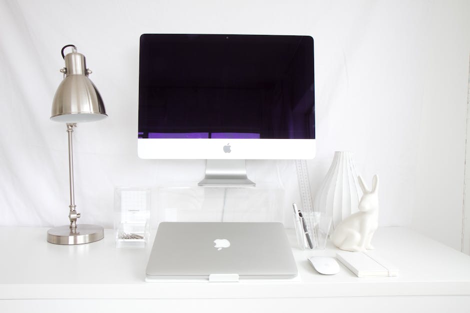
Hidden Tech That Still Feels Like Home
Tech is getting smarter and quieter. Hidden speakers, frame TVs, and integrated lighting systems are no longer high-end flexes. They’re becoming the norm—and vloggers are making them look effortless. The key? Keep the tech invisible but impactful.
Wall-mounted screens that double as art, sound systems tucked into minimal decor, and lighting that adjusts based on time of day all help you shoot better without cluttering your space. And your audience notices. Clean setups feel intentional. They let your content breathe.
But don’t chase sleek at the cost of soul. A well-designed setup should enhance your vibe, not erase it. Go warm on texture. Use layered lighting. Let your space say something about you. The tech should serve the story, not compete with it.
Adding informal nooks to your space isn’t just about style—it’s about creating smaller moments inside bigger rooms. Drop in an accent chair, throw down a soft rug, and put a reading lamp in the mix. That’s all it takes to carve out a quiet spot where everything doesn’t have to feel wide open and center staged.
In open-plan layouts where everything blends together, these small setups help give the space a bit of structure without walls. A cozy corner with a chair and lamp becomes its own destination without much fuss. Whether it’s for reading, scrolling, or zoning out with coffee, having these little zones adds comfort without clutter.
Cookie-cutter rooms don’t cut it anymore. In 2024, authenticity is what makes a space pop on camera—and off. Vloggers are leaning into decor that reflects who they are. That means mixing in vintage treasures from flea markets, patches of local color from trips abroad, and handmade items that turn rooms into something warmer than a product catalog.
This isn’t about following a Pinterest board to the letter. It’s about showing your viewers your taste, experiences, and quirks through the way you live. A room with a story is more memorable than one chasing the latest trend. The messier truth? Personality sells. So whether it’s an old concert poster, a chair picked up on a road trip, or a DIY wall hanging, if it means something to you, it adds value. That’s the kind of space people remember—and the kind that builds connection.
Modern design isn’t a strict playbook. It’s a flexible mix of form and function that bends to fit the way you live. Gone are the days of designing a space around trends. Today, it’s more about what actually makes your life easier, calmer, and a little more sensible.
This means it’s okay to mix high-end with secondhand, minimalism with personality, tech with nature. The best modern spaces aren’t picture-perfect—they’re livable. If simplicity works for your routine, lean into it. If you thrive with bold color or layered textures, that’s fair game too.
At its core, thoughtful design isn’t about impressing anyone. It’s about supporting daily life without getting in the way. When a space feels natural, you know it’s working.
 Norvain Elthros has opinions about interior decorating tips. Informed ones, backed by real experience — but opinions nonetheless, and they doesn't try to disguise them as neutral observation. They thinks a lot of what gets written about Interior Decorating Tips, Outdoor Living Ideas, Creative Concepts is either too cautious to be useful or too confident to be credible, and they's work tends to sit deliberately in the space between those two failure modes.
Reading Norvain's pieces, you get the sense of someone who has thought about this stuff seriously and arrived at actual conclusions — not just collected a range of perspectives and declined to pick one. That can be uncomfortable when they lands on something you disagree with. It's also why the writing is worth engaging with. Norvain isn't interested in telling people what they want to hear. They is interested in telling them what they actually thinks, with enough reasoning behind it that you can push back if you want to. That kind of intellectual honesty is rarer than it should be.
What Norvain is best at is the moment when a familiar topic reveals something unexpected — when the conventional wisdom turns out to be slightly off, or when a small shift in framing changes everything. They finds those moments consistently, which is why they's work tends to generate real discussion rather than just passive agreement.
Norvain Elthros has opinions about interior decorating tips. Informed ones, backed by real experience — but opinions nonetheless, and they doesn't try to disguise them as neutral observation. They thinks a lot of what gets written about Interior Decorating Tips, Outdoor Living Ideas, Creative Concepts is either too cautious to be useful or too confident to be credible, and they's work tends to sit deliberately in the space between those two failure modes.
Reading Norvain's pieces, you get the sense of someone who has thought about this stuff seriously and arrived at actual conclusions — not just collected a range of perspectives and declined to pick one. That can be uncomfortable when they lands on something you disagree with. It's also why the writing is worth engaging with. Norvain isn't interested in telling people what they want to hear. They is interested in telling them what they actually thinks, with enough reasoning behind it that you can push back if you want to. That kind of intellectual honesty is rarer than it should be.
What Norvain is best at is the moment when a familiar topic reveals something unexpected — when the conventional wisdom turns out to be slightly off, or when a small shift in framing changes everything. They finds those moments consistently, which is why they's work tends to generate real discussion rather than just passive agreement.