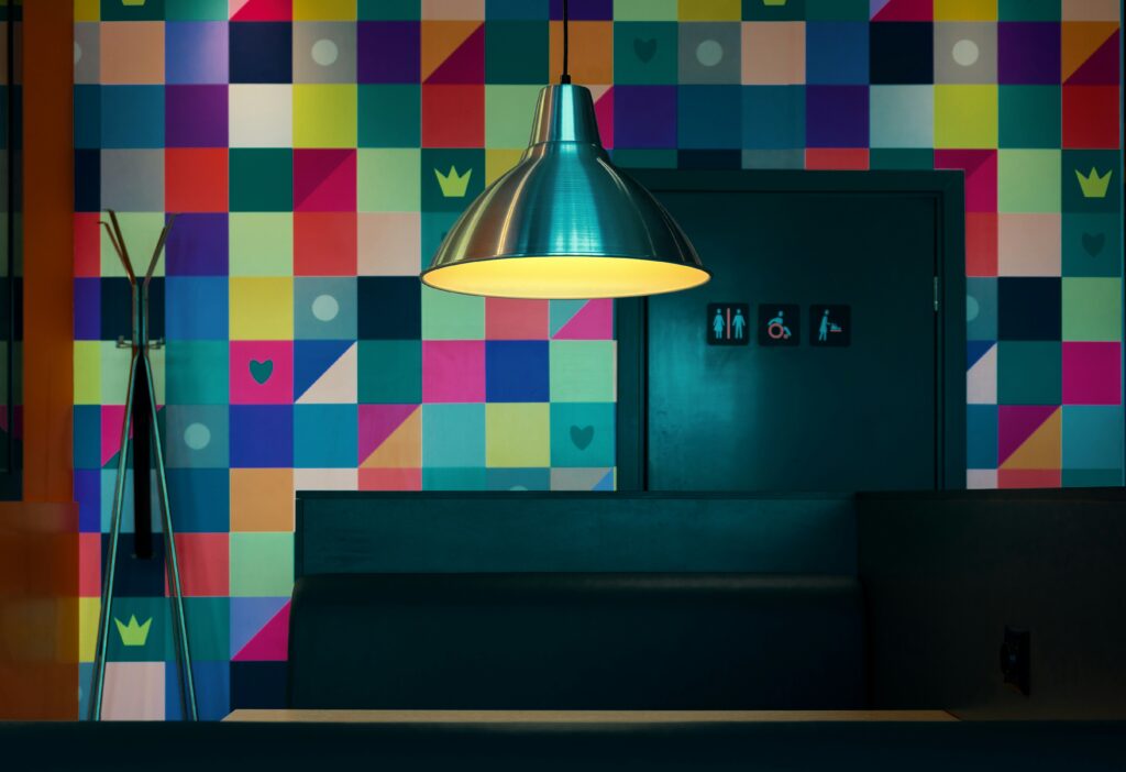
Color isn’t just decoration. It’s impact. In interior spaces, it’s one of the quiet forces that determines how we feel—whether we notice it or not. Think about the calm of a pale blue wall or the alert energy of a bright yellow kitchen. Color taps into our instincts.
Psychologically, our brains link colors to moods and meanings. Blues and greens often bring a feeling of calm or balance. Warm tones like orange or red can energize or even agitate, depending on how they’re used. Neutrals act as stabilizers. It’s not magic. It’s decades of sensory programming, culture, and biology working together.
When choosing colors for a home, you’re shaping more than a look. You’re setting the emotional tone of the space. That’s the difference between a house that just looks good and one that actually feels like home.
Mastering Color Theory in Your Space
A solid understanding of color theory can elevate any room from basic to beautifully cohesive. It’s not just about picking favorite hues—it’s about creating mood, harmony, and visual balance.
Complimentary vs. Analogous Palettes
Choosing the right color palette is key to creating a room that feels intentional, not overwhelming.
- Complimentary palettes use colors opposite each other on the color wheel (like blue and orange). This combo creates high contrast and vibrant energy.
- Analogous palettes group colors next to each other (like blue, blue-green, and green). The result is more subtle and harmonious.
When to use each:
- Go complimentary for bold, high-energy spaces like entertainment areas.
- Choose analogous for relaxing spaces like bedrooms or reading nooks.
Using the 60-30-10 Rule
This tried-and-true rule helps you distribute colors proportionally:
- 60%: Dominant color (e.g., walls)
- 30%: Secondary color (e.g., furniture)
- 10%: Accent color (e.g., pillows, decor)
Why it works: It adds balance and rhythm, making your space visually appealing without being chaotic.
Common Pitfalls to Avoid
Choosing the right color combination isn’t just about what looks good on a swatch. Here are a few missteps to watch out for:
- Clashing hues: Bright colors placed together with no grounding elements can overwhelm the eye. Use neutrals to anchor them.
- Too monochromatic: A space that’s all one shade can feel flat or lifeless. Add layers through texture, materials, and subtle variations in tone.
- Ignoring lighting: Natural and artificial lighting can drastically change how a color looks. Always test paint samples in different lighting before committing.
Resource for More Tips
For additional guidance on avoiding common design mistakes, check out this helpful read:
10 Common Decorating Mistakes and How to Fix Them
Color isn’t just an aesthetic choice in vlogging — it’s an emotional cue. Warm tones like reds, oranges, and yellows tend to give off energy, optimism, and urgency. They’re great for content that needs to feel personal, friendly, or bold. Cool tones like blues and greens bring calm, trust, and clarity. Think tech, minimal lifestyle, or reflective storytelling. Most audiences won’t consciously notice the shift, but they’ll feel it.
Cultural and personal associations weigh in, too. In Western contexts, white often signals simplicity or purity. In parts of Asia, it represents mourning. Red might say romance to one viewer and danger to another. The smart creators dig into who their audiences are and design their palettes accordingly.
Then there are light, saturation, and brightness — the workhorses of visual influence. A washed-out vlog with low light can feel flat and uninviting. Bright, well-lit shots with punchy saturation are more engaging and shareable. You don’t need a film school degree to improve your visuals. Just start paying attention. Mood lives in the margins, and light is often the loudest voice in the room.
Bedroom
Bedrooms are where calm matters most, and color can make or break that mood. Soft blues, muted greens, and warm grays do the heavy lifting—quieting the space without feeling sterile. These colors help slow the mind and soften the edges of a long day.
Lighting plays backup. After sunset, cool light can feel harsh. It’s better to lean into warmer bulbs that mimic firelight or a fading sun. It keeps the tone dialed down and invites rest. A smart combination of wall color and lighting transforms the room into a steady exhale, night after night.
Let Light Lead: Designing with Natural Light in Mind
Lighting can make or break the way your colors look in a space. It’s not just about the aesthetic you imagine under showroom lights but how that mood holds up in your real environment—especially under natural daylight.
Natural Lighting: Your Color Wildcard
Natural light changes throughout the day, shifting how paint colors, textiles, and finishes appear. A color that looks subtle at noon can feel overpowering by evening. Let the light in before locking anything down.
- Observe your space in morning, afternoon, and evening light
- Test swatches under natural daylight before committing
- Let large windows guide your color palette
Paint First, Furnish Second
One of the most common design missteps is choosing a statement piece or expensive sofa first, then trying to make paint work around it. Instead, commit to your wall colors first—then curate furniture and decor to layer in harmony.
- Choose paint with your lighting in mind
- Build your room’s style around that color mood
- Accent with pieces that complement, not compete
Trust Your Instinct—but Always Double-Check
Your creative instinct is essential, but daylight tells the truth. What feels like the right shade one night can shift entirely in the morning. Use sampling methods that align with real-life lighting.
- Revisit decisions at different times of day
- Take photos in both natural and artificial light
- Your gut counts, but so does clarity in daylight
Style in vlogs isn’t just about aesthetics. It’s a mood-setter. The colors you wear, the lighting you choose, even your editing rhythm—all of it speaks to how you want people to feel when they watch. Want calm? Lean into warm neutrals and steady cuts. Going for hype? High-contrast visuals and quick transitions get the job done. Vloggers are becoming more intentional with these choices, linking emotional tone directly to visual style.
Mood boards are making a comeback behind the scenes. They’re quick, scrappy, and get ideas flowing fast. Swatches, palettes, and sample edits help creators test the waters without committing to a full rebrand. Low-risk trial runs give you the freedom to play. Try a week of lo-fi vlogging. Experiment with a bolder thumbnail style. No stress, no overhaul. Just clear feedback on what fits—and what clicks.
Color psychology doesn’t shout—it whispers. But those whispers can change everything about how a space feels. It’s not about chasing trends or going with whatever paint shade is hot on Pinterest. It’s about asking yourself how you want to feel when you walk into the room. Calm? Energized? Grounded?
Warm earth tones can make a room feel safe and steady. Cool blues can bring in a little clarity. Yellow can spark just enough brightness to shift a mood. You don’t have to redo the whole place. Sometimes it’s as simple as changing your curtain color, swapping the art on the wall, or picking a different throw for the couch.
In a small space, subtle color tweaks can go a long way. They don’t just change looks—they change behavior. A space that feels right invites you to stay longer, breathe deeper, and live better. Try adjusting one thing. See what happens.
 Norvain Elthros has opinions about interior decorating tips. Informed ones, backed by real experience — but opinions nonetheless, and they doesn't try to disguise them as neutral observation. They thinks a lot of what gets written about Interior Decorating Tips, Outdoor Living Ideas, Creative Concepts is either too cautious to be useful or too confident to be credible, and they's work tends to sit deliberately in the space between those two failure modes.
Reading Norvain's pieces, you get the sense of someone who has thought about this stuff seriously and arrived at actual conclusions — not just collected a range of perspectives and declined to pick one. That can be uncomfortable when they lands on something you disagree with. It's also why the writing is worth engaging with. Norvain isn't interested in telling people what they want to hear. They is interested in telling them what they actually thinks, with enough reasoning behind it that you can push back if you want to. That kind of intellectual honesty is rarer than it should be.
What Norvain is best at is the moment when a familiar topic reveals something unexpected — when the conventional wisdom turns out to be slightly off, or when a small shift in framing changes everything. They finds those moments consistently, which is why they's work tends to generate real discussion rather than just passive agreement.
Norvain Elthros has opinions about interior decorating tips. Informed ones, backed by real experience — but opinions nonetheless, and they doesn't try to disguise them as neutral observation. They thinks a lot of what gets written about Interior Decorating Tips, Outdoor Living Ideas, Creative Concepts is either too cautious to be useful or too confident to be credible, and they's work tends to sit deliberately in the space between those two failure modes.
Reading Norvain's pieces, you get the sense of someone who has thought about this stuff seriously and arrived at actual conclusions — not just collected a range of perspectives and declined to pick one. That can be uncomfortable when they lands on something you disagree with. It's also why the writing is worth engaging with. Norvain isn't interested in telling people what they want to hear. They is interested in telling them what they actually thinks, with enough reasoning behind it that you can push back if you want to. That kind of intellectual honesty is rarer than it should be.
What Norvain is best at is the moment when a familiar topic reveals something unexpected — when the conventional wisdom turns out to be slightly off, or when a small shift in framing changes everything. They finds those moments consistently, which is why they's work tends to generate real discussion rather than just passive agreement.