They might sit quietly in the corner, but shelves are pulling more weight than ever. These days, they’re not just décor. They’re personality pieces, mood-setters, and subtle storytellers. What you stack, lean, or display says more about you than you think.
The best part? Shelves are easy and forgiving. You can shift things around depending on the season, your mood, or a sudden 2 a.m. inspiration. They let you tell stories without saying a word. No nails, no big commitments. Want a pop of color? A mini library? A plant parade? It’s all fair game.
And you’re never really done with them. That’s the appeal. They’re flexible, portable, and always ready for a refresh. A good shelf setup evolves with you.
Eclectic Gallery Walls Done Right
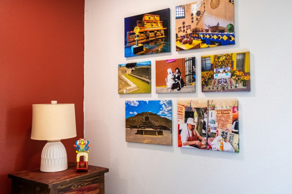
Creating a gallery wall that feels curated—not chaotic—takes more than just throwing frames up on a wall. When done thoughtfully, a mix of mediums, textures, and eras can add a personal and visually rich layer to your space.
Mix Your Mediums
A dynamic gallery wall often includes more than just photographs. Think:
- Photography: Black-and-white or richly colored prints can set the tone.
- Illustration: Hand-drawn or graphic styles offer striking focal points.
- Posters and Prints: Vintage designs, contemporary art, or limited editions.
- Objects: Try framed textiles, small sculptural pieces, or meaningful memorabilia.
Balance Variety with Unity
You can mix frame types, but create visual harmony by choosing at least one unifying element:
- Color palette: Stick to warm neutrals, cool tones, or another cohesive scheme.
- Material: Use frames that share a similar finish like wood, metal, or matte black.
- Theme: Link your pieces through subject matter, such as nature, travel, or abstract forms.
Embrace Contrast for Character
Don’t be afraid to pair vintage and modern pieces. The contrast between an antique frame and a clean-lined print can create depth and personality.
- Juxtapose old and new elements to avoid a space feeling too matchy.
- Let differences in style or era start a conversation—visual tension adds interest.
Creating a gallery wall shouldn’t feel like following a rulebook. The best results come from curating items that mean something to you while still considering balance, flow, and cohesion.
Before you start hammering frames into drywall, ask yourself one thing: what story do you want this wall to tell? A gallery wall isn’t just decoration. It’s a visual narrative. Maybe it’s about family. Maybe it’s about travel. Or maybe it’s just abstract shapes that make you feel calm. The mood should guide every choice—color, layout, frame style.
Next, anchor that story to the right space. A hallway invites curiosity, perfect for a timeline of memories or vintage finds. A living room can handle bolder, more expressive pieces. Staircases like movement; staggered layouts work well with the incline. Let the room’s function shape the wall’s voice.
And when it comes to size, remember: not everything has to go big. A small, tight cluster of pieces can say more than a splashy floor-to-ceiling setup. Sometimes impact comes from restraint. Step back, squint, and ask yourself: does the wall feel intentional? If yes, you’re on the right track.
Before hammering a single nail, map your layout. Lay the pieces on the floor or use a digital mockup tool to preview the arrangement. This gives you room to experiment without commitment, and it helps you avoid extra holes in the wall.
Finding the right balance between symmetry and asymmetry makes a wall feel intentional, not accidental. If everything is too even, it can feel stiff. Not enough structure, and it looks cluttered. Anchor with one or two dominant shapes or colors, then let the rest play off that structure.
As a rule of thumb, odd numbers tend to look more natural. Three or five pieces in a cluster will read more like a curated statement and less like a home goods showroom. Trust your eye, but step back often to see how the placement feels from a distance.
Hanging art isn’t just about tossing something on a hook and calling it done. The details matter. Start with spacing. Don’t cram your pieces together—give each one room to breathe. Crowded walls distract from the work and make everything feel heavier than it is. Less clutter means more impact.
Forget the rigid ‘eye level’ rule. It shifts depending on your room, wall height, and even the purpose of the space. A minimalist kitchen nook and a cozy reading room won’t call for the same visual rhythm. Trust your eyes and test different heights before you commit.
If measurement makes your palms sweat, use help. Templates, paper mockups, painter’s tape—it all works. These low-stress tools let you tweak layouts and spacing quickly without extra holes in the wall. The end goal: clean, intentional placement that feels natural, not calculated.
Treat It Like a Collection, Not a Final Product
Vlogs in 2024 aren’t one-and-done projects. They’re evolving collections. Trying to perfect a single upload before moving on is a trap. Instead, top creators are building layered libraries—series, themes, callbacks—that give viewers something to grow with. Think less masterpiece, more living archive.
This doesn’t mean you should post half-finished thoughts. It means you leave open doors. Mention future ideas, revisit earlier episodes, update old takes. Keep your vlog flexible without letting it feel scattered. Audiences appreciate when creators are building in public. It makes the content more honest—and more bingeable.
Rotating pieces in and out is also part of the shift. Retouch what works. Archive what doesn’t. Add depth without losing your core. Creators who treat their vlog channels like evolving playlists—not final albums—tend to stick around longer and stay more relevant.
Great walls don’t need to scream—they just need to speak clearly. Lighting is the underrated tool that does exactly that. Forget blasting the whole wall with floodlights. Instead, spotlight key pieces. Use adjustable picture lights, sconces, or directional ceiling fixtures to highlight texture, color contrast, or even negative space. Light pulls the eye. Use it with purpose.
When it comes to matting and framing, steal from the pros: go with thick mats for breathing room and solid frames for structure. Keep frames consistent in tone or material for a cohesive look. Mixing too many colors and styles confuses the eye—and the mood.
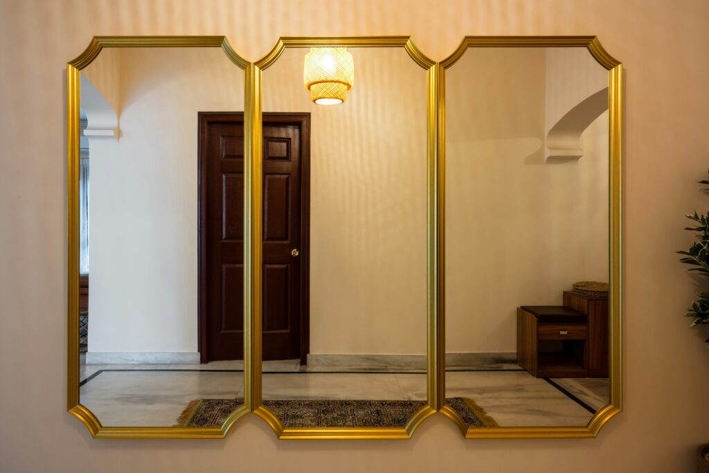
Now, for the curveballs. Elevate your wall with more than just flat visuals. Mirrors bounce light and open up the room. Textiles add physical texture and warmth—think woven hangings or small rugs as wall art. And 3D objects (like sculptural shelves, ceramic pieces, or vintage signage) bring unexpected depth. It’s not just what hangs—it’s how it lives in the space.
Looking for bold design options beyond walls? Check out: Statement Ceilings – How to Turn Fifth Walls Into Art.
No two gallery walls should look alike. That’s the whole point. Your wall is more than decoration — it’s a snapshot of who you are, what you’ve seen, and what matters to you. Think books you love turned into prints, photos from that one perfect road trip, or a thrift store painting you couldn’t walk past.
Done right, a gallery wall doesn’t just fill blank space. It tells a story in layers. It changes conversation. It holds memory and mood.
And it should never be finished. Style evolves. You grow, move, trade stuff out. Framing one piece today doesn’t mean it stays forever. That fluidity is the charm. Let it breathe.
 There is a specific skill involved in explaining something clearly — one that is completely separate from actually knowing the subject. Shirley Forbiset has both. They has spent years working with home design inspirations in a hands-on capacity, and an equal amount of time figuring out how to translate that experience into writing that people with different backgrounds can actually absorb and use.
Shirley tends to approach complex subjects — Home Design Inspirations, Interior Decorating Tips, Sustainable Home Practices being good examples — by starting with what the reader already knows, then building outward from there rather than dropping them in the deep end. It sounds like a small thing. In practice it makes a significant difference in whether someone finishes the article or abandons it halfway through. They is also good at knowing when to stop — a surprisingly underrated skill. Some writers bury useful information under so many caveats and qualifications that the point disappears. Shirley knows where the point is and gets there without too many detours.
The practical effect of all this is that people who read Shirley's work tend to come away actually capable of doing something with it. Not just vaguely informed — actually capable. For a writer working in home design inspirations, that is probably the best possible outcome, and it's the standard Shirley holds they's own work to.
There is a specific skill involved in explaining something clearly — one that is completely separate from actually knowing the subject. Shirley Forbiset has both. They has spent years working with home design inspirations in a hands-on capacity, and an equal amount of time figuring out how to translate that experience into writing that people with different backgrounds can actually absorb and use.
Shirley tends to approach complex subjects — Home Design Inspirations, Interior Decorating Tips, Sustainable Home Practices being good examples — by starting with what the reader already knows, then building outward from there rather than dropping them in the deep end. It sounds like a small thing. In practice it makes a significant difference in whether someone finishes the article or abandons it halfway through. They is also good at knowing when to stop — a surprisingly underrated skill. Some writers bury useful information under so many caveats and qualifications that the point disappears. Shirley knows where the point is and gets there without too many detours.
The practical effect of all this is that people who read Shirley's work tend to come away actually capable of doing something with it. Not just vaguely informed — actually capable. For a writer working in home design inspirations, that is probably the best possible outcome, and it's the standard Shirley holds they's own work to.