How to Strategically Use a Single Accent Wall
Adding a single accent wall is one of the easiest ways to give a room an instant style upgrade. But for it to work well, you need to be thoughtful about when, where, and how you use it.
When and Where to Add an Accent Wall
Not all rooms benefit equally from an accent wall. Consider the purpose of the space, natural light, and how the wall will interact with what’s already in the room.
Ideal rooms to consider:
- Living Room: Use an accent to highlight your TV wall or fireplace.
- Bedroom: Behind the headboard is a natural focal point.
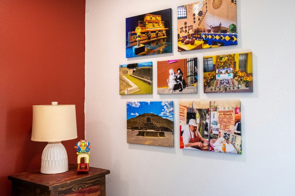
- Hallway: Add visual interest in narrow or transitional areas.
Proportion and Placement Tips
Before deciding on your accent wall placement, think about balance. A poorly positioned wall can make the room feel chaotic, not cohesive.
Smart placement strategies include:
- Choose the wall you first see when entering the room
- Avoid placing an accent wall behind overly busy or cluttered layouts
- Keep proportions in mind — smaller rooms benefit from softer contrasts, while more spacious areas can handle bolder tones
- Test paint or wallpaper samples first to see how lighting changes perception throughout the day
Final Thought
A well-positioned accent wall adds depth and character. Done wrong, it can overwhelm a room. The key is to enhance, not distract.
Materials Matter More Than Ever
Design in 2024 is all about texture, depth, and subtle impact. Surface finishes play a bigger role than ever when curating spaces that feel modern, intentional, and uniquely your own.
Natural and Industrial Surfaces
Want to add dimension without clutter? It’s all about the mix of raw and refined materials:
- Wood slats create rhythm and bring in warmth
- Metal panels offer sleek contrast and subtle shine
- Concrete textures ground the space with an architectural feel
These materials can be applied as accent walls, ceilings, or even unexpected cabinetry finishes to instantly elevate the aesthetic.
Fabric and Wallpaper: Small Changes, Big Effect
Soft surfaces are gaining traction too. While the bold wallpaper trends of previous years are still around, more people are reaching for:
- Light texture fabrics on walls or furniture
- Wallpaper with tone-on-tone patterns for visual subtlety
- Upholstery and soft panels that reduce echo and add comfort
These additions bring a quiet sense of sophistication and are especially effective in smaller rooms or transitional spaces.
Paint Still Works, But Think Beyond It
Paint will always be the fastest and most affordable way to transform a space. But if you’re looking for more depth and interest, layering with material changes is key.
- Use paint as a foundation, then build with texture
- Accent panels or mixed materials help rooms feel more finished
Tip Worth Exploring
For more inspiration on how to use unique finishes effectively, check out this guide: Unexpected Materials That Work Wonders in Home Decor
Bold design elements have earned their place in modern homes. They’re no longer just accents or outliers. In today’s interiors, they play a defining role — anchoring spaces, creating contrast, and offering personality without clutter.
The key is balance. A bold sofa doesn’t mean the whole room needs to shout. A statement wall can coexist with a quiet palette. The smartest designs use boldness as a tool, not a gimmick. It’s about drawing the eye where it counts and keeping the rest of the space clean and livable.
One of the biggest misconceptions is that bold means bright, loud, or chaotic. In reality, bold can be a matte black fixture, a sharp silhouette, or a single unexpected texture. It’s confidence in form and placement. And done right, it elevates without overwhelming.
Color isn’t just decoration anymore—it’s a signal. In 2024, vloggers are choosing between bold, bright palettes that grab eyeballs instantly or deep, rich tones that hold attention and add nuance. Brights still do their job in the scroll wars, but if your content leans into storytelling or moody aesthetics, saturated earth tones or jewel-like shades pull viewers in with more intention.
The finish matters, too. Matte has grown up—it feels editorial and grounded, keeping focus on the message. Gloss still works, especially in beauty or high-energy content, but gloss alone doesn’t carry mood—it amplifies it. Choosing between matte and shine boils down to what emotional tone your video wants to hit.
Neutrals are also evolving. Creators aren’t leaning on blank canvas beiges anymore. Think stormy greys, sandy taupes, or muted olives that feel cinematic without stealing the spotlight. These tones support your visuals without swallowing them.
Whatever direction you go, the trick is cohesion. Your color choices should elevate your existing visual identity, not fight with it. Let the palette serve the story, not distract from it.
When it comes to visual storytelling, texture does more heavy lifting than most people realize. In a vlog setup, going for well-placed texture instead of loud, busy patterns keeps the focus where it belongs—on the creator. A textured backdrop adds depth and dimension without fighting for attention. Patterns can distract or clash with on-screen elements, especially when compressed on mobile screens.
3D wall tiles, shiplap, and subtle plaster finishes are showing up more often in creator studios for good reason. They’re clean but not flat. They add just enough character to a frame to make it feel intentional. These materials give a tactile quality to the space without overwhelming it.
Lighting is the unsung hero here. With the right angle, soft light can throw shadows that bring out the texture’s detail and make even a small space feel dynamic. A flat wall lit poorly is just bland. But texture under smart lighting becomes a tool for mood and style. It’s not about having more—it’s about using less, better.
Design Tricks that Elevate Every Corner
Making a space feel intentional doesn’t always require a full renovation. Small choices in color, contrast, and layout can create dramatic effects—especially in open or compact areas. Here are a few well-placed design tactics to transform your home effortlessly:
Behind the Bed: Instant Luxe Backdrop
A styled area behind the bed can act as a focal point and bring a room together. Instead of letting the headboard carry all the design weight, consider these options:
- Accent wall in a rich, saturated tone
- Textured wallpaper or wood paneling
- Oversized art with clean, symmetrical framing
This simple update creates depth and adds a sense of luxury without cluttering the bedroom.
Dining Areas with Warm Wood Tones
Dining spaces often benefit from contrast. Natural wood—especially in medium to dark tones—adds warmth and instantly grounds a space.
- Use a raw-edge wooden table against sleek or modern chairs
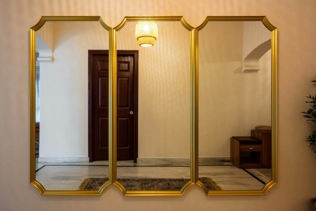
- Add wood-framed mirrors, sideboards, or lighting fixtures
- Mix tonal woods for a balanced, layered effect
This blend of modern and organic creates a welcoming environment for daily meals or gatherings.
Small Nooks: Go Bold in Tight Spots
Compact spaces are ideal for high-impact design. Rather than trying to make them feel bigger, make them memorable.
- Choose bold prints or dark, moody paint colors
- Add peel-and-stick wallpaper for a rental-friendly option
- Style with standout lighting or a sculptural chair
These tucked-away corners become creative statements that show off your personality.
Open Concept: Define Without Walls
Open layouts offer flexibility but can feel undefined. Smart styling helps break up the space while maintaining a cohesive look.
- Use area rugs to set boundaries between spaces
- Employ lighting levels to create zones (e.g., pendant lights over dining, floor lamps by the sofa)
- Position furniture to guide movement and conversation
These subtle shifts create visual clarity without losing the open, flowing feel that makes these layouts so popular.
Accent walls pack a punch, but they need space to breathe. In rooms already filled with patterns, textures, or bold furniture, an extra accent wall just creates noise. Let the wall be the centerpiece by pulling back elsewhere.
The best approach? Keep the decor around it clean. Furniture should be simple and low-profile. Accessories minimal. Think of the wall as the lead actor—everything else is the supporting cast.
Negative space is your ally. That empty area around the wall is what makes it pop. If every inch of the room is competing for attention, nothing stands out.
Finally, balance matters. Use symmetry or strong horizontal and vertical lines to ground the room. A centered piece of wall art, matching lamps, or a tidy arrangement of shelves helps calm the layout. Your accent wall becomes the anchor—not just another loud element in the room.
Accent walls are having a moment again, but this time it’s less about splashy paint experiments and more about thoughtful design. When done right, an accent wall doesn’t scream for attention — it anchors the room. It serves a purpose, whether that’s highlighting a fireplace, defining a workspace, or adding depth to a minimal layout.
The key is restraint. One texture, one color, one idea. Skip the gallery wall plus color block plus LED combo. That’s chaos, not style. Focus on materials and tones that complement the rest of the space. Let the wall speak for itself without dragging the eye all over the room.
An accent wall should create clarity, not clutter. Make sure it adds function too — maybe it draws in natural light, improves acoustics, or frames your video backdrop cleanly. Drama is welcome, as long as it’s planned. Think sharp outlines and clean finishes, not just visual noise.
 Irene Mooressit writes the kind of outdoor living ideas content that people actually send to each other. Not because it's flashy or controversial, but because it's the sort of thing where you read it and immediately think of three people who need to see it. Irene has a talent for identifying the questions that a lot of people have but haven't quite figured out how to articulate yet — and then answering them properly.
They covers a lot of ground: Outdoor Living Ideas, DIY Home Improvement Projects, Sustainable Home Practices, and plenty of adjacent territory that doesn't always get treated with the same seriousness. The consistency across all of it is a certain kind of respect for the reader. Irene doesn't assume people are stupid, and they doesn't assume they know everything either. They writes for someone who is genuinely trying to figure something out — because that's usually who's actually reading. That assumption shapes everything from how they structures an explanation to how much background they includes before getting to the point.
Beyond the practical stuff, there's something in Irene's writing that reflects a real investment in the subject — not performed enthusiasm, but the kind of sustained interest that produces insight over time. They has been paying attention to outdoor living ideas long enough that they notices things a more casual observer would miss. That depth shows up in the work in ways that are hard to fake.
Irene Mooressit writes the kind of outdoor living ideas content that people actually send to each other. Not because it's flashy or controversial, but because it's the sort of thing where you read it and immediately think of three people who need to see it. Irene has a talent for identifying the questions that a lot of people have but haven't quite figured out how to articulate yet — and then answering them properly.
They covers a lot of ground: Outdoor Living Ideas, DIY Home Improvement Projects, Sustainable Home Practices, and plenty of adjacent territory that doesn't always get treated with the same seriousness. The consistency across all of it is a certain kind of respect for the reader. Irene doesn't assume people are stupid, and they doesn't assume they know everything either. They writes for someone who is genuinely trying to figure something out — because that's usually who's actually reading. That assumption shapes everything from how they structures an explanation to how much background they includes before getting to the point.
Beyond the practical stuff, there's something in Irene's writing that reflects a real investment in the subject — not performed enthusiasm, but the kind of sustained interest that produces insight over time. They has been paying attention to outdoor living ideas long enough that they notices things a more casual observer would miss. That depth shows up in the work in ways that are hard to fake.