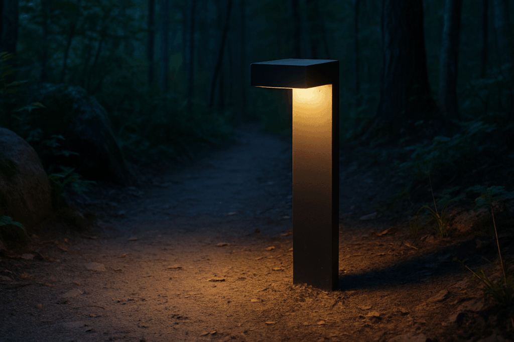
Understand the Purpose of Each Space
Before you start browsing for prints or propping canvases against the wall, stop and ask: what is this room supposed to feel like? Because the right art doesn’t just fill a space it shapes it. Bedrooms should feel restful. Offices should have a bit of edge. Dining rooms need warmth, not distraction. In other words, aesthetics follow function.
If a space is quiet and personal, lean into soft tones, muted colors, and gentle themes. Think landscapes, abstract forms, or minimal line drawings for a bedroom a calm visual helps wind things down. On the flip side, a workspace or home gym benefits from art with energy: bold color, geometric shapes, maybe a loud typographic piece that makes you sit up straight.
You’re not just decorating walls. You’re setting the emotional tone. Match the intensity of the imagery to the mood you want to create, and the rest of the room will fall in line.
Sizing and Scale: Where Most People Go Wrong
Let’s get one thing straight: size matters a lot when it comes to wall art. Too small and it floats awkwardly. Too big and it swallows the room. The sweet spot? Aim for artwork that fills about two thirds to three quarters of the wall width. Above a sofa or console, the piece (or the grouping) should be roughly that width as well. That ratio keeps the room grounded and cohesive.
Now, oversized art. It can be a bold move that works if you let it breathe. Big pieces need space to own the wall. Minimal decor around them. Otherwise, it just looks crammed. On the flip side, if you’re working with a bunch of smaller pieces, consider the gallery cluster. Uniform frames or a clear unifying theme keep it from becoming a chaotic mess. Beyond form, spacing matters. One to two inches between each piece is a good visual buffer. Don’t overthink the layout start with one anchor piece and build outwards.
As for height: center your art at eye level. That’s around 57 60 inches from the floor to the center of the piece. Hanging it too high is the quickest way to make a space feel off. If you’re working over furniture, leave about 6 to 10 inches of breathing room between the bottom of the art and the top of the furniture. Close enough to feel connected, but not so low it looks like a mistake.
Get scale and positioning right, and even the simplest piece of art can feel like it belongs.
Color and Mood: Subtle Impacts Matter
The wrong color choice can throw off an entire room. The right one can quietly tie everything together. When selecting wall art, think in terms of alignment, not just contrast. Choose pieces that echo or gently enhance your existing palette don’t fight it. If your space features tans and muted greens, a neon pink canvas will pull the focus in ways that feel disconnected. You’re looking for cohesion, not conflict.
Warm colors (reds, oranges, yellows) tend to energize. They’re good for active zones like kitchens, living rooms, or workspaces. Cool tones (blues, greens, purples) invite calm and are ideal for bedrooms or reading nooks. Knowing this, don’t just pick art you like consider what kind of emotion the space should hold.
One smart trick? Use existing statement pieces like a rug, throw, or standout furniture as a baseline. Pulling an accent color from those elements and finding art that supports or reflects it creates harmony without getting too matchy. This is how a room starts to feel considered instead of chaotic.
Mixing Styles Without Creating Chaos
Blending modern and vintage art can dial up the character in a room if you do it with intention. The trick is to keep the mix curated, not chaotic. That means choosing pieces that speak to each other tonally or thematically, even if they come from different decades. A mid century abstract can live comfortably next to a clean lined contemporary photo if their colors or subject matter complement one another.
Uniformity comes from structure, not sameness. Use identical or coordinating frames to give mismatched art a shared visual language. Pay attention to spacing leave consistent breathing room between pieces to avoid clutter. Grid layouts work for tighter symmetry; looser gallery walls benefit from intentional anchoring points, like balancing a dramatic vintage oil painting with two smaller modern prints.
Don’t shy away from mixing price points. A $15 flea market sketch can sit next to a gallery stamped original if it holds meaning or visual weight. The goal isn’t to impress with cost but to tell a cohesive story. A high low approach adds texture and forms a layered aesthetic that feels lived in, not showroom staged. The difference between chaos and character is choosing what belongs and letting go of what doesn’t.
Let the Room Speak: Art by Room Type
Each room in your home has its own purpose and emotional tone. Choosing the right wall art means matching those nuances while reinforcing overall cohesion.
Living Room: Set the Tone with Statement Pieces
The living room is often the social heart of the home, making it the perfect place to showcase personality and style through bold, impactful art.
Go Big: Consider one large statement piece above the sofa or fireplace that anchors the space.
Reflect Personality: Choose pieces that reflect your lived experiences, interests, or style (e.g. urban photography, expressive abstracts, or cultural artwork).
Symmetry vs. Focal Point:
Opt for symmetrical arrangements when aiming for a polished or formal look.
Use deliberate asymmetry to create visual interest and a more relaxed aesthetic.
Bedroom: Art That Calms and Grounds
In the bedroom, art should promote rest and serenity. Calming visuals and gentle color palettes create a soothing backdrop.
Tone and Theme: Favor emotionally consistent imagery think landscapes, soft abstracts, or botanical prints.
Smart Placement:
Above the bed: a single panoramic piece or set of two/three related prints work well.
Corner galleries: use smaller framed works in soft, layered layouts to make cozy nooks.
Kitchen and Dining: Add Character Without Clutter
Wall art in kitchen and dining areas should add charm and interest without overwhelming spaces already rich in texture and visual detail.
Keep It Small & Impactful: Choose smaller scale artwork that doesn’t compete with cabinetry or appliances.
Artwork Ideas:
Still lifes (fruits, florals, ceramics)
Typography based prints (quotes, food related phrases)
Whimsical or nostalgic pieces that prompt conversation
Hallways and Transitional Spaces: Tell a Story in Motion
These often overlooked spaces are a creative opportunity for casual storytelling and exploration through art.
Chronological Galleries: Display family photos or travel art in a sequence that tells a visual narrative.
Vertical or Narrow Pieces: Take advantage of limited wall widths with tall, slim works or hanging sculptures.
Experiment with Layouts: Try evenly spaced frames or organic arrangements for visual rhythm as one moves through the space.
Intentional choices by room help tie together your decor while honoring the unique function of each living space.
Don’t Ignore Current Trends
Even if your aesthetic leans timeless, staying aware of current wall art trends helps keep your space feeling intentional not frozen in time. Right now, interiors are leaning into calm and organic. Neutral toned prints think soft beiges, gentle grays, and earthy textures are everywhere. They’re easy to layer, don’t clash with your furniture, and they create visual breathing room.
Nature photography is also making a clean comeback. Not overly polished or dramatic just honest shots of landscapes, botanicals, even macro leaves. Perfect for pairing with wood tones or minimal modern furniture.
For something a bit bolder but still in the lane of simplicity, abstract linework keeps trending strong, particularly in minimalist spaces. One or two line illustrations in black ink or charcoal offer just enough structure without overwhelming a room. Restraint is the magic here.
(Explore more Trending Interior Design)
Final Tips for a Cohesive Feel
Creating a well balanced aesthetic throughout your home isn’t just about choosing beautiful artworks it’s about tying everything together so that each room flows into the next. Here’s how to give your wall art a more intentional, unified role in your overall design:
Repeat Elements to Create Visual Harmony
To create cohesion, repeat certain visual cues across different rooms. This doesn’t mean duplicating the same pieces, but rather echoing themes, shapes, or tones for a subtly connected atmosphere.
Color: Use a shared color palette throughout your artwork to maintain balance. This could mean recurring accent tones or background hues.
Theme: Choose a common theme like nature, geometry, or portraiture and feature variations of that across spaces.
Form: Select works with a similar visual weight or structure, such as line based illustrations or textured canvases, to create consistency.
Factor Lighting Into Placement
Lighting can dramatically impact how wall art is perceived. Poor placement can wash out color or create harsh glare neither of which flatters your space or your art.
Natural light: Be mindful of artworks placed near windows. Sunlight can fade delicate materials over time.
Artificial light: Use adjustable sconces or picture lights to highlight important pieces and create ambiance.
Consistency: Ensure lighting temperature and intensity are consistent across rooms to avoid color distortion in your artwork.
Let Your Art Grow With You
Style evolves and your art should too. While you don’t need to overhaul your entire collection every year, keeping your curation fresh ensures it continues reflecting your taste and the current feel of your home.
Rotate seasonally: Swap out specific works to reflect seasonal palettes or moods.
Upgrade slowly: As your budget allows, invest in signature pieces that can become long term staples.
Edit regularly: Remove art that no longer serves the space or your current aesthetic to keep your collection intentional.
A cohesive look starts with details. Repetition, mindful placement, and a willingness to evolve your collection will help your walls feel as curated as the rest of your space.
 Norvain Elthros has opinions about interior decorating tips. Informed ones, backed by real experience — but opinions nonetheless, and they doesn't try to disguise them as neutral observation. They thinks a lot of what gets written about Interior Decorating Tips, Outdoor Living Ideas, Creative Concepts is either too cautious to be useful or too confident to be credible, and they's work tends to sit deliberately in the space between those two failure modes.
Reading Norvain's pieces, you get the sense of someone who has thought about this stuff seriously and arrived at actual conclusions — not just collected a range of perspectives and declined to pick one. That can be uncomfortable when they lands on something you disagree with. It's also why the writing is worth engaging with. Norvain isn't interested in telling people what they want to hear. They is interested in telling them what they actually thinks, with enough reasoning behind it that you can push back if you want to. That kind of intellectual honesty is rarer than it should be.
What Norvain is best at is the moment when a familiar topic reveals something unexpected — when the conventional wisdom turns out to be slightly off, or when a small shift in framing changes everything. They finds those moments consistently, which is why they's work tends to generate real discussion rather than just passive agreement.
Norvain Elthros has opinions about interior decorating tips. Informed ones, backed by real experience — but opinions nonetheless, and they doesn't try to disguise them as neutral observation. They thinks a lot of what gets written about Interior Decorating Tips, Outdoor Living Ideas, Creative Concepts is either too cautious to be useful or too confident to be credible, and they's work tends to sit deliberately in the space between those two failure modes.
Reading Norvain's pieces, you get the sense of someone who has thought about this stuff seriously and arrived at actual conclusions — not just collected a range of perspectives and declined to pick one. That can be uncomfortable when they lands on something you disagree with. It's also why the writing is worth engaging with. Norvain isn't interested in telling people what they want to hear. They is interested in telling them what they actually thinks, with enough reasoning behind it that you can push back if you want to. That kind of intellectual honesty is rarer than it should be.
What Norvain is best at is the moment when a familiar topic reveals something unexpected — when the conventional wisdom turns out to be slightly off, or when a small shift in framing changes everything. They finds those moments consistently, which is why they's work tends to generate real discussion rather than just passive agreement.