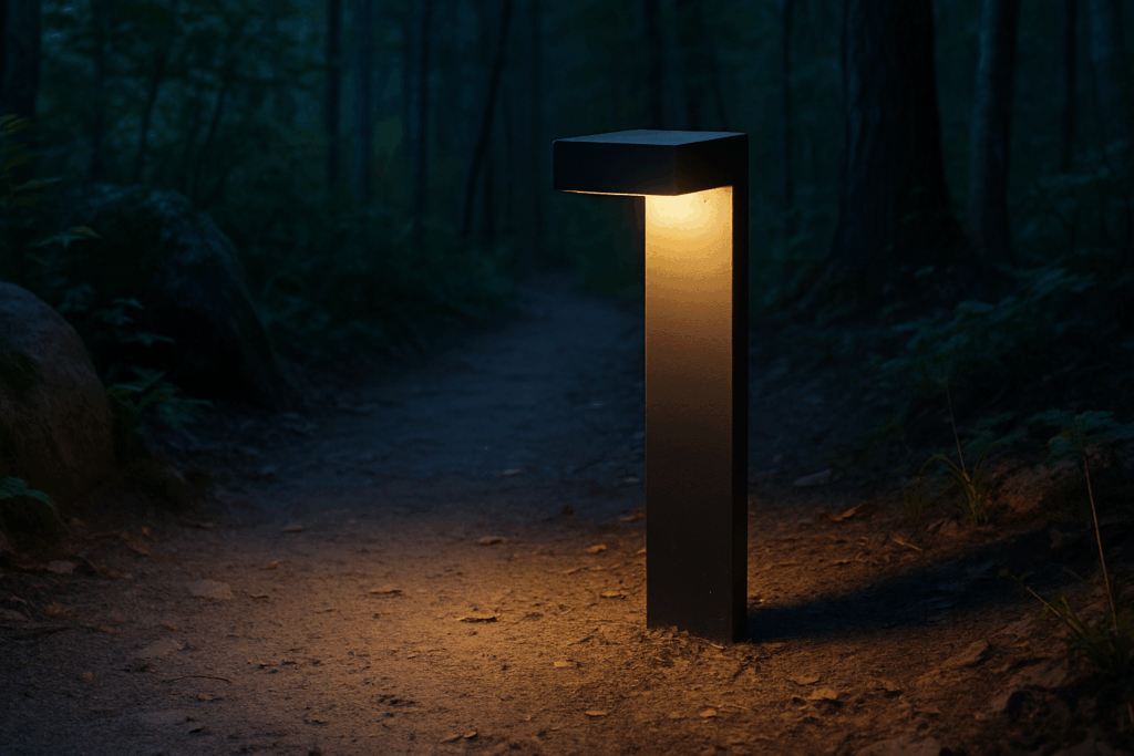
Understanding the Power of Color
Color isn’t just decoration it’s psychological. What you paint on your walls can impact how you feel and function day to day. Studies in color psychology have shown that the shades surrounding us influence mood, decision making, stress, and even sleep cycles. It’s subtle, but powerful. Walk into a deep blue room and you’ll likely feel calm. Sit in a bright yellow kitchen and your energy spikes. That’s the kind of shift color brings.
Wall color in particular matters because it sets the tone in a space. It’s the backdrop for the hours you work, eat, relax, or rest. The right hue can help you focus, lower anxiety, or boost productivity without you even realizing why.
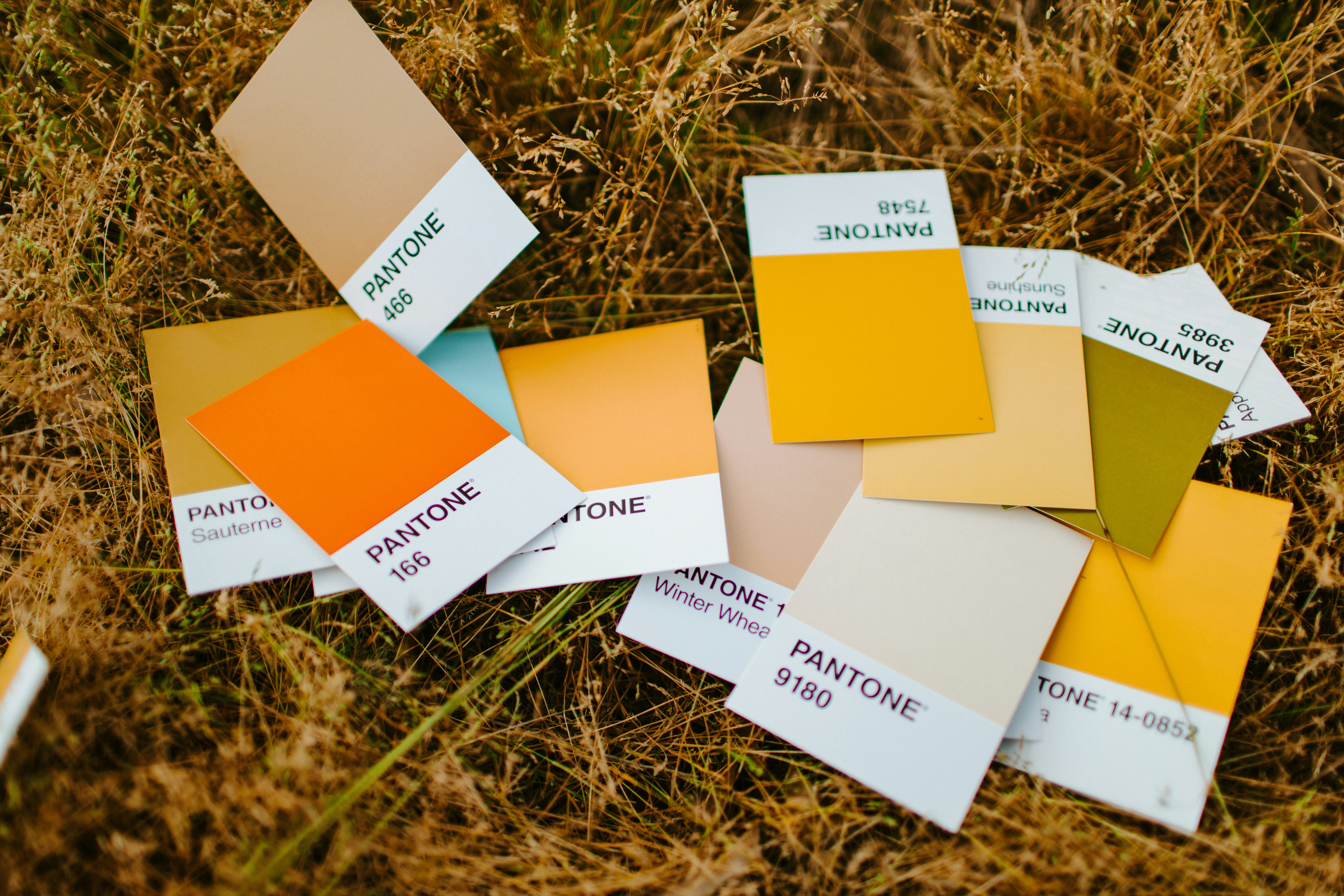
Here’s a quick breakdown of how common colors tend to land:
Blue: Ideal for bedrooms or workspaces. It promotes calm, concentration, and mental clarity.
Yellow: Brings energy and optimism. Best in kitchens, entryways, or places where natural light is scarce.
Green: Balances and restores. It’s versatile works in living rooms, bedrooms, or anywhere that needs a steady vibe.
Red: Warm and passionate, but not for the faint of heart. Use in moderation think dining room accents or cozy dens.
Neutrals: Grounding options like gray, beige, and taupe adapt well to almost any room. Flexible, subtle, and easy to layer with bolder pieces.
The goal isn’t following a strict formula it’s using color intentionally. When the energy of your space aligns with how you want to live in it, you’ll feel the difference.
Choosing Colors Room by Room
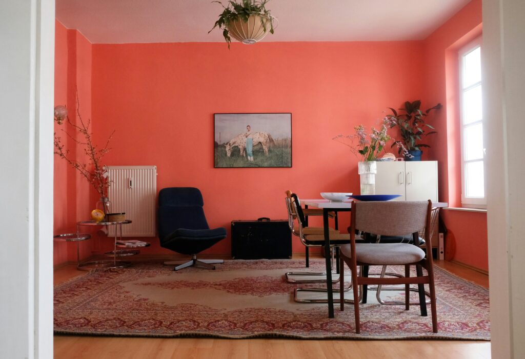
Living Room: This is the space where people gather, so lean into warm, earthy tones think terracotta, soft golds, muted oranges. These shades create a sense of comfort and help keep conversations flowing. Stay away from colors that feel too stark or cold; they can shut the room down emotionally.
Bedroom: Here’s where cool tones step up. Soft blues, dusty lavenders, or sage greens are ideal for signaling rest and calm. If you want something cozier, go deeper navy, charcoal, or even forest green. These shades wrap the room in warmth without overstimulating your brain before bed.
Kitchen: This space should feel alive. Warm yellows, soft greens, or even peachy neutrals can energize the room and encourage connection. These colors hint at freshness and vitality great for spaces where you eat, chat, and move around a lot. Plus, they pair well with natural wood or white cabinetry.
Home Office: You don’t need much to get focused but the right color helps. Soft blues or gentle neutrals (like greige or taupe) promote mental clarity without becoming too clinical. Bold colors can be distracting here, so keep things muted and balanced. You’re looking for a backdrop that supports deep thinking, not constant stimulation.
Bathroom: Clean and light wins here. Crisp whites, pale blues, or seafoam greens dial up the freshness and make even tiny bathrooms feel open. Want a spa vibe? Stick with muted palettes and steer clear of heavy contrasts. This is your reset zone it should feel like a breath of fresh air.
Common Decorating Traps to Watch For
It’s easy to get swept away by bold color choices especially when you’re inspired by a magazine spread or a trending post. But too much intensity can turn a room into a sensory overload. Bright reds, electric blues, and neon accents might look striking on a screen, but living with them 24/7 is a different story. Visual stress is real, and you’ll feel it if your walls start to shout at you.
Natural light matters more than most people think. That mustard yellow swatch that looked warm and rich in store? In a dimly lit hallway, it might come off dingy and dull. Before locking in a shade, test it in morning, afternoon, and artificial light. Colors shift. Don’t let bad lighting mess up a good idea.
And let’s talk trends. Just because terracotta or deep teal is having a moment doesn’t mean it’ll feel right in your space or match your vibe three months from now. Choose colors that feel like you, not just what’s hot on a reel.
To avoid regret: pair bold tones with neutrals to ground the space. Try sample paint swatches on your actual walls, and live with them for a few days. See how they feel honestly. Decoration isn’t about chasing aesthetics; it’s about how your space supports your life.
More practical advice here: decorating mistakes to avoid
Pro Tips for Pulling It All Together
Color isn’t just about making a room look good it’s about making a home feel like it flows. Walking from space to space should feel intentional, not jarring. Use subtle gradations or repeating tones to thread a visual line through your rooms. For example, a soft terracotta used in the living room might echo faintly in hallway art or bedroom linens.
Accent colors may be small in footprint but big in impact. A few well placed pillows, a bold rug, or a framed print can shift the energy of a room without locking you into a major design commitment. You can refresh them seasonally or swap them as your taste evolves.
Also, color goes way beyond what’s on the walls. That slate blue cabinet or warmly tinted light fixture is doing just as much heavy lifting as any gallon of paint. Textiles, material finishes, and lighting temperature all help shape the color story of a room and of the home as a whole.
Finally, trust your gut. Rules are fine, but what matters most is how a space makes you feel. If a color combination sparks a good emotional response, go with it. Personal comfort always beats perfect theory.
(For other pitfalls to dodge along the way, take a look at some decorating mistakes to avoid.)
 There is a specific skill involved in explaining something clearly — one that is completely separate from actually knowing the subject. Shirley Forbiset has both. They has spent years working with home design inspirations in a hands-on capacity, and an equal amount of time figuring out how to translate that experience into writing that people with different backgrounds can actually absorb and use.
Shirley tends to approach complex subjects — Home Design Inspirations, Interior Decorating Tips, Sustainable Home Practices being good examples — by starting with what the reader already knows, then building outward from there rather than dropping them in the deep end. It sounds like a small thing. In practice it makes a significant difference in whether someone finishes the article or abandons it halfway through. They is also good at knowing when to stop — a surprisingly underrated skill. Some writers bury useful information under so many caveats and qualifications that the point disappears. Shirley knows where the point is and gets there without too many detours.
The practical effect of all this is that people who read Shirley's work tend to come away actually capable of doing something with it. Not just vaguely informed — actually capable. For a writer working in home design inspirations, that is probably the best possible outcome, and it's the standard Shirley holds they's own work to.
There is a specific skill involved in explaining something clearly — one that is completely separate from actually knowing the subject. Shirley Forbiset has both. They has spent years working with home design inspirations in a hands-on capacity, and an equal amount of time figuring out how to translate that experience into writing that people with different backgrounds can actually absorb and use.
Shirley tends to approach complex subjects — Home Design Inspirations, Interior Decorating Tips, Sustainable Home Practices being good examples — by starting with what the reader already knows, then building outward from there rather than dropping them in the deep end. It sounds like a small thing. In practice it makes a significant difference in whether someone finishes the article or abandons it halfway through. They is also good at knowing when to stop — a surprisingly underrated skill. Some writers bury useful information under so many caveats and qualifications that the point disappears. Shirley knows where the point is and gets there without too many detours.
The practical effect of all this is that people who read Shirley's work tend to come away actually capable of doing something with it. Not just vaguely informed — actually capable. For a writer working in home design inspirations, that is probably the best possible outcome, and it's the standard Shirley holds they's own work to.