
I’ve walked into hundreds of homes where every room feels like it belongs in a different house.
You’re probably here because your space looks fine in pieces but something feels off when you step back. The living room doesn’t talk to the kitchen. The bedroom clashes with the hallway. Nothing flows.
Here’s what I know: creating a cohesive look isn’t about buying all new furniture or hiring someone to do it for you. It’s about understanding a few core principles that professionals use every single time.
I’ve spent years working on residential and commercial spaces at thtintdesign. The same framework works whether you’re fixing one room or redoing your entire home.
This article gives you the exact steps to make your space feel pulled together. Not vague inspiration. Actual principles you can apply today.
You’ll learn how to create visual harmony between rooms, what elements need to match (and what doesn’t), and how to spot the disconnects that are making your space feel disjointed.
No complicated design theory. Just the practical stuff that works.
Step 1: Define Your Core Design Language
You can’t design a cohesive space if you don’t know what you’re designing toward.
I see this all the time. People buy a beautiful rug. Then they find a couch they love. Add some art that catches their eye. And suddenly nothing works together.
Some designers will tell you to just go with your gut. Buy what you love and it’ll all come together naturally. They say overthinking kills creativity.
But here’s the problem with that approach.
Your gut changes. What you love on Tuesday might feel wrong by Friday. Without a clear direction, you end up with a room that looks like five different Pinterest boards crashed into each other.
I’m not saying you need to be rigid. But you do need a plan.
Think of it like interior design ideas thtintdesign teaches us. Start with a clear language and everything else falls into place.
Establish Your Concept
Before you buy anything, create a mood board.
I use Pinterest or even just a folder on my phone. Collect images that feel right to you. Not just rooms you like but textures, colors, even outdoor scenes that capture the vibe you want.
Look for patterns. Do you keep saving images with warm woods? Lots of natural light? Clean lines or curves?
That’s your aesthetic talking.
The 60-30-10 Color Rule
This one changed how I approach color.
Here’s how it works:
| Percentage | Usage | Example |
|---|---|---|
| 60% | Dominant color (walls, large furniture) | Soft white or warm gray |
| 30% | Secondary color (upholstery, curtains) | Sage green or navy |
| 10% | Accent color (pillows, art, accessories) | Terracotta or brass |
Your dominant color covers most of the space. Walls and big pieces. The secondary shows up in medium-sized items. And your accent? That’s the pop that makes everything interesting.
(Pro tip: Your accent color should be the boldest choice. This is where you can take risks.)
Select a Material Palette
Pick three to five materials and stick with them.
I usually go with light oak for warmth. Linen for softness. Maybe brushed brass for a bit of shine. Then I repeat these across different rooms in different ways.
Oak dining table in the kitchen. Oak frame on the bedroom mirror. Oak shelving in the living room.
See how that works?
You’re not buying matching furniture sets. You’re creating visual threads that tie everything together. It feels intentional without looking like a showroom.
The key is repetition without being boring. Same materials but different applications.
Step 2: Weave a Visual Thread for Seamless Flow
You’ve picked your palette. You know your core materials.
Now comes the part most people mess up.
They treat each room like its own little island. Different vibes. Different rules. And when you walk through the house, it feels choppy.
I see this all the time. A modern kitchen that opens into a farmhouse dining room. Then you turn the corner and suddenly you’re in a coastal bedroom.
It’s jarring.
Some designers will tell you that each room should have its own personality. That variety keeps things interesting. And sure, you want some distinction between spaces. In the world of gaming interiors, embracing the philosophy of variety, as championed by Thtintdesign, not only enhances the unique personality of each room but also keeps players engaged and immersed in their virtual adventures.
But here’s what they’re missing.
Your home isn’t a museum where each room is a separate exhibit. You actually live here. You move from space to space dozens of times a day.
The real skill? Making everything feel connected while still giving each room its purpose.
The Power of Repetition
Pick one element from your palette and let it show up everywhere.
Maybe it’s that terracotta accent color you love. Use it in throw pillows in the living room. Bring it back in kitchen towels. Let it appear again in bedroom artwork.
Your eye picks up on this. It creates a rhythm as you move through the house.
Same goes for materials. If you’re using brass fixtures in the bathroom, don’t switch to chrome in the kitchen (unless you really know what you’re doing).
This isn’t about making everything match. It’s about creating a thread that ties the whole place together.
Consistent Architectural Elements
Here’s where you build your foundation.
I always tell clients to think about flooring first. Running the same flooring through main living areas does more for flow than any decorating trick.
Trim color matters too. White baseboards and door frames throughout the house? That’s your canvas. It lets you play with wall colors while keeping everything grounded.
And those interior doors. Keep the style consistent. You’d be surprised how much visual noise comes from mixing door styles.
These choices might seem boring. But they’re what make thtintdesign work at a foundational level.
Managing Sightlines and Transitions
Stand in your main hallway and look around.
What do you see through each doorway?
Most people never think about this. But every doorway is a frame. And what you see through that frame either reinforces your design or fights against it.
When I’m working on a space, I walk the common paths. I look at what’s visible from the kitchen into the dining room. From the entryway into the living space.
If your dining room table is visible from three different rooms, it needs to work with all three spaces.
You might be wondering what comes after you nail these sightlines. How do you actually furnish these connected spaces without everything looking too matchy?
That’s where scale and proportion come in. But we’ll get to that next.
Step 3: Layering for Depth and a Polished Finish
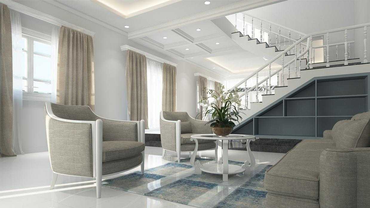
I walked into a client’s living room last year and something felt off.
The colors worked. The furniture fit the space. But it looked flat. Like a showroom that nobody actually lived in.
She’d done everything right on paper. But she stopped at the basics.
Here’s what I told her. Cohesion gets you halfway there. Layering is what makes a room feel finished.
Some designers say you should keep things minimal. Less is more and all that. They argue that adding layers just creates clutter and makes spaces feel busy.
And sure, I’ve seen rooms that went overboard. Too many pillows. Too much stuff on every surface.
But stripping everything down to the bare minimum? That’s how you end up with a space that feels cold.
Start with Your Lighting
Most people rely on one overhead fixture and call it done.
That’s a mistake.
I always tell clients to think in three layers. You need ambient lighting for general visibility. Task lighting where you actually do things (reading, cooking, working). And accent lighting to highlight what matters. When creating the perfect gaming setup, remember that Finding the Right Desk Thtintdesign is crucial, as it not only supports your ambient and task lighting needs but also enhances the overall aesthetic and functionality of your space.
A single floor lamp in the corner changes everything. So does a table lamp on that empty console.
Add Texture Through Textiles
Your couch shouldn’t be naked.
I mean it. A throw blanket over the arm. A couple of pillows in different fabrics. Maybe a rug that actually anchors the seating area instead of that tiny thing that’s too small for the space.
Mix your textures. Linen curtains with a wool throw. Velvet pillows next to something nubby and rough.
It’s what makes a room feel like you can actually sink into it.
The Art of Arranging Decor
This is where most people freeze up.
They buy a beautiful vase or a set of books and then just… line them up like soldiers.
Here’s what works better. Group things in odd numbers. Three candles at different heights. A stack of books with a small object on top.
(I learned this the hard way after spending an entire afternoon rearranging a client’s bookshelf because everything looked too symmetrical.)
Pro tip: If a surface looks too busy, remove one thing. If it looks too empty, add something with height.
The goal isn’t perfection. It’s making your space feel like someone with taste actually lives there.
When you get interior design thtintdesign right, people can’t quite put their finger on why a room works. They just know it does.
That’s layering.
Common Mistakes That Destroy Cohesion
You walk into a home and something feels wrong.
The rooms look fine individually. But moving from space to space? It’s jarring.
I see three mistakes that kill cohesion more than anything else.
The Theme Room Problem
Going full nautical in your bathroom might seem fun. Anchor wallpaper, rope mirrors, seashell soap dispensers.
But then you step into your hallway and it feels like you’ve left a beach resort and entered a completely different house.
Theme rooms work in hotels because you’re only there for a night. In your home, they create hard stops that break the visual flow. Your eye has to reset every time you move between spaces.
Some designers say themed rooms add personality. They argue that each space should tell its own story.
Here’s what they’re missing. Personality doesn’t require costume design. You can love coastal style without turning a room into a literal ship cabin.
Scale and Proportion Issues
I’ve seen beautiful rooms ruined by a rug that stops two feet short of the sofa.
Or a sectional so massive it makes a 12×14 room feel like a closet.
When you’re finding the right desk thtintdesign or any furniture piece, the measurements matter as much as the style. A desk that’s proportionally wrong throws off the entire room, even if everything else is perfect.
Your furniture needs to fit the space, not fight it.
The Negative Space Problem
Empty space isn’t wasted space.
But most people treat every surface like it needs something on it. Every wall needs art. Every corner needs a plant stand.
The result? Visual chaos.
Your eye needs places to rest. When everything is filled, nothing stands out. The interior design thtintdesign approach that works best gives each piece room to breathe. Embracing the philosophy that less is more, the Interior Design Ideas Thtintdesign approach emphasizes the importance of negative space, allowing each element to shine in its own right while creating a harmonious and inviting atmosphere.
Pull back. Let your space have some quiet moments.
Your Blueprint for a Harmonious Space
You came here because your rooms felt off and you couldn’t figure out why.
I get it. You’d arrange furniture and pick colors but something still looked disconnected. That’s frustrating when you’re putting in the effort.
Now you have a three-step framework that actually works. Define your design language. Create a visual thread. Layer thoughtfully.
These aren’t vague tips. They’re the exact process I use at thtintdesign to pull spaces together.
You’re not guessing anymore. You control how the final look comes together.
Here’s what to do next: Pick one room today and define its 60-30-10 color palette. Write it down. That’s your foundation.
This single step starts the transformation. It’s how you build the unified home you’ve been wanting.
The framework is yours now. Use it.
 Norvain Elthros has opinions about interior decorating tips. Informed ones, backed by real experience — but opinions nonetheless, and they doesn't try to disguise them as neutral observation. They thinks a lot of what gets written about Interior Decorating Tips, Outdoor Living Ideas, Creative Concepts is either too cautious to be useful or too confident to be credible, and they's work tends to sit deliberately in the space between those two failure modes.
Reading Norvain's pieces, you get the sense of someone who has thought about this stuff seriously and arrived at actual conclusions — not just collected a range of perspectives and declined to pick one. That can be uncomfortable when they lands on something you disagree with. It's also why the writing is worth engaging with. Norvain isn't interested in telling people what they want to hear. They is interested in telling them what they actually thinks, with enough reasoning behind it that you can push back if you want to. That kind of intellectual honesty is rarer than it should be.
What Norvain is best at is the moment when a familiar topic reveals something unexpected — when the conventional wisdom turns out to be slightly off, or when a small shift in framing changes everything. They finds those moments consistently, which is why they's work tends to generate real discussion rather than just passive agreement.
Norvain Elthros has opinions about interior decorating tips. Informed ones, backed by real experience — but opinions nonetheless, and they doesn't try to disguise them as neutral observation. They thinks a lot of what gets written about Interior Decorating Tips, Outdoor Living Ideas, Creative Concepts is either too cautious to be useful or too confident to be credible, and they's work tends to sit deliberately in the space between those two failure modes.
Reading Norvain's pieces, you get the sense of someone who has thought about this stuff seriously and arrived at actual conclusions — not just collected a range of perspectives and declined to pick one. That can be uncomfortable when they lands on something you disagree with. It's also why the writing is worth engaging with. Norvain isn't interested in telling people what they want to hear. They is interested in telling them what they actually thinks, with enough reasoning behind it that you can push back if you want to. That kind of intellectual honesty is rarer than it should be.
What Norvain is best at is the moment when a familiar topic reveals something unexpected — when the conventional wisdom turns out to be slightly off, or when a small shift in framing changes everything. They finds those moments consistently, which is why they's work tends to generate real discussion rather than just passive agreement.