I’ve designed enough kitchens to know that minimalism doesn’t mean empty.
You’re probably here because you want a clean kitchen that actually works for your life. Not some showroom that looks great but makes cooking a nightmare.
Here’s the thing: most people strip everything away and wonder why their kitchen feels like a doctor’s office. Cold. Uninviting. Not a place you want to spend time.
I’m going to show you how to design a minimalist kitchen that’s warm and functional. One that has clean lines but doesn’t sacrifice the things you need every day.
Start with how you actually use your kitchen. Not how you think you should use it.
This guide walks through the principles that work. The ones I’ve tested in real homes with real people who cook, entertain, and live in their spaces.
You’ll learn which elements to keep, which to cut, and how to add warmth without cluttering up your counters.
No theory. Just the practical steps that create a kitchen you’ll love using.
The Core Principles of Minimalist Kitchen Design
Let me walk you through what actually makes a minimalist kitchen work.
Principle 1: Intentionality Over Deprivation
Here’s where most people get it wrong. They think minimalism means throwing everything out and living with bare counters.
That’s not it.
I want you to think about intentionality instead. Every item in your kitchen should earn its spot. That fancy garlic press you used once? It’s taking up space that could go to something you actually reach for daily.
Start by asking yourself what you use every week. Those items stay. Everything else needs to justify why it’s there.
Principle 2: Form Follows Function
Your kitchen layout should make cooking feel natural, not like you’re running an obstacle course.
Place your prep area between the fridge and stove. Keep your most-used utensils within arm’s reach of where you actually cook. When you’re designing a kitchen, the workflow matters more than how pretty it looks in photos.
I’ve seen too many beautiful kitchens that are a pain to work in. Don’t make that mistake.
Principle 3: A Cohesive, Limited Palette
Stick with two or three colors max. White and wood tones work. Gray with black accents works. What doesn’t work is trying to incorporate every color you like.
The restraint creates breathing room. Your eyes don’t have to work as hard.
But here’s the trick. Use texture to keep things interesting. Matte cabinets with a polished stone counter. Smooth walls with a textured backsplash. Same color family, different feels.
The Foundation: Cabinets, Countertops, and Backsplashes
Let me be honest with you.
Most people get this part completely wrong.
They walk into a showroom and fall in love with ornate cabinet hardware or busy tile patterns. Then they wonder why their kitchen feels cluttered even after spending thousands.
I’m going to tell you something that might sound boring at first.
The best kitchens hide their complexity.
Cabinets: The Unsung Hero
I’m a big believer in flat-panel or handleless cabinet doors. Push-to-open mechanisms or integrated pulls that disappear into the design.
Some designers will tell you that traditional raised-panel cabinets add character. That you need visible hardware to make a statement.
I disagree.
Those details fight for attention. And in a space where you’re already dealing with appliances and cookware and everything else, you don’t need more visual noise.
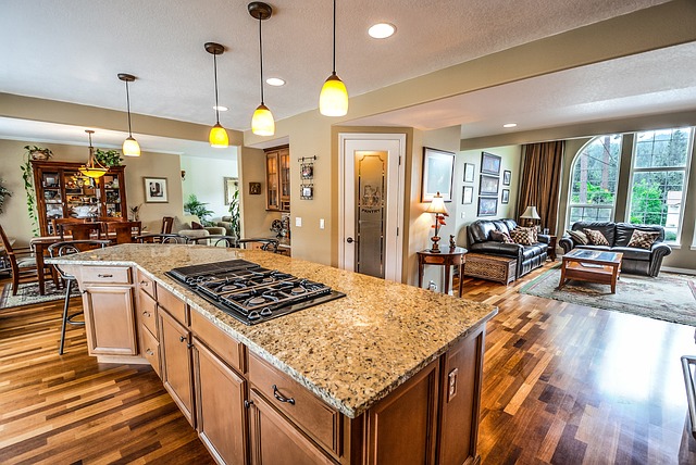
Floor-to-ceiling cabinetry is where I draw a hard line. Not just because it gives you more storage (though it does). It creates these clean vertical lines that make your ceiling feel higher than it actually is. Incorporating elements like floor-to-ceiling cabinetry not only enhances storage but also elevates the overall aesthetic of a space, a concept brilliantly captured by Thtintdesign, which emphasizes the importance of vertical lines in creating an illusion of height and sophistication.
When you stop the cabinets halfway up the wall, you create a visual break. That break makes the room feel chopped up.
Countertops: Sleek and Durable Surfaces
I’ve worked with a lot of materials over the years.
Quartz is my go-to for most projects. The uniform appearance means no weird veining that pulls your eye around the room. Plus it holds up better than most people expect.
Honed granite works too if you want something with a bit more texture. Concrete can look incredible but you need to know what you’re getting into with maintenance.
Here’s what matters most to me though.
Thin profiles or waterfall edges that flow seamlessly from horizontal to vertical surfaces. I’ve seen too many kitchens ruined by thick, chunky countertops that look like they belong in a different era. For the full picture, I lay it all out in Online Furniture Selection Thtintdesign.
The waterfall edge especially. When done right, it makes your island feel like one continuous piece instead of a slab sitting on a box.
Backsplashes: The Seamless Transition
This is where I see the biggest mistakes.
People treat the backsplash like it’s supposed to be the star of the show. They pick these intricate mosaic patterns or mix three different materials.
My take? Extend your countertop material up the wall.
That monolithic look eliminates the visual break between counter and wall. Your eye doesn’t have to stop and process a transition. It just flows.
If that’s not in your budget (and I get it, that can get expensive), go with large-format tiles. Match your grout color to the tile. The goal is to minimize those grid lines that chop up your wall.
I know some people love the look of contrasting grout. They think it adds interest.
But interest isn’t what you need here. You need calm. You need a backdrop that lets you actually cook without feeling overwhelmed.
When you’re planning your space, remember that these three elements work together. Your cabinets set the tone. Your countertops define the surfaces. Your backsplash either supports that vision or fights against it.
Choose wisely.
(And if you want more tips for designing a kitchen thtintdesign, I’ve got plenty more where this came from.)
Functional Minimalism: Smart Storage and Integrated Appliances
Most people think minimalism means getting rid of stuff.
That’s not it.
Real minimalism is about hiding what you need so your space feels calm. Your kitchen can hold everything without looking cluttered.
The trick? Make your appliances disappear.
Conceal Don’t Reveal
I’m talking about panel-ready appliances.
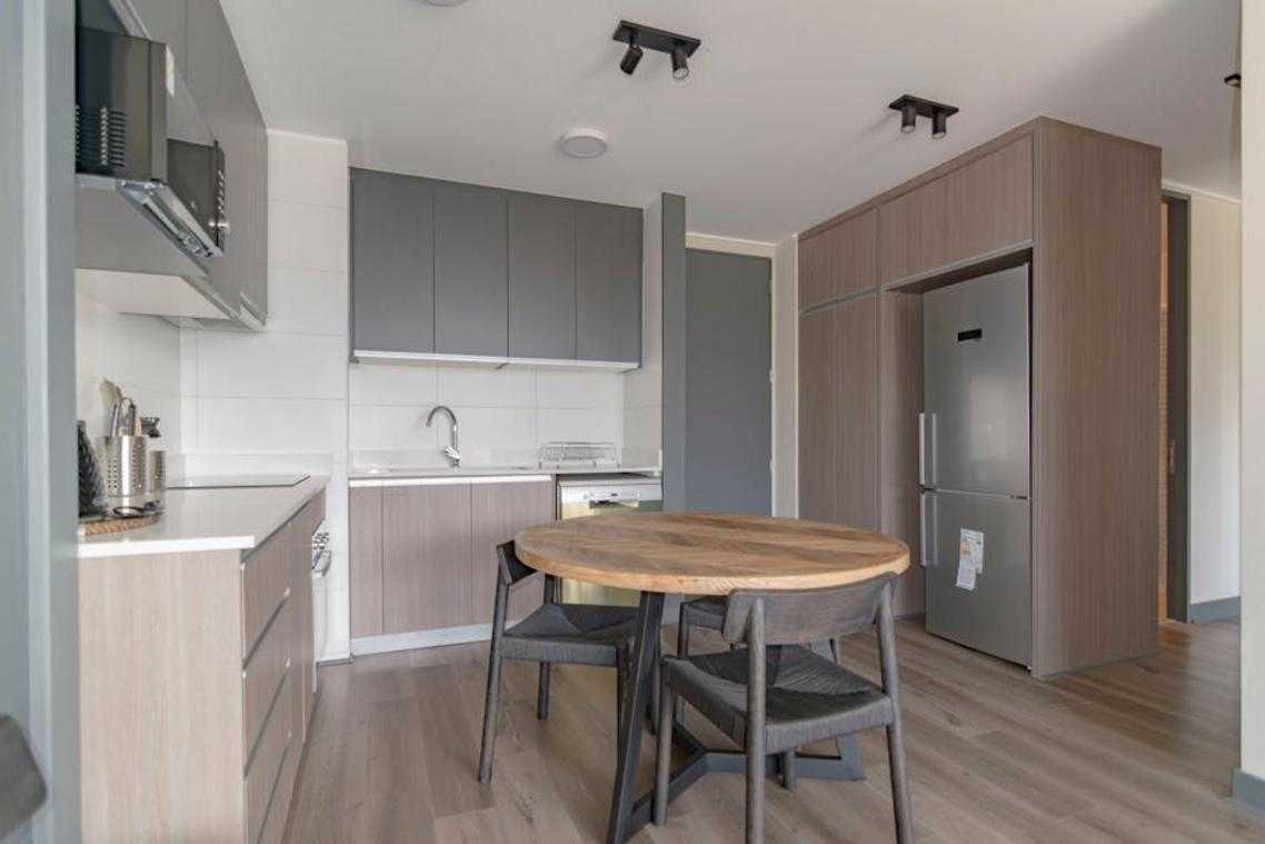
Your refrigerator shouldn’t announce itself the second someone walks in. Neither should your dishwasher. When you match them to your cabinetry, they vanish into the design.
It sounds simple but the difference is huge. A stainless steel fridge breaks up your visual flow. A panel-ready one? It’s just another cabinet door.
Some designers say this approach costs too much for what you get. They argue that statement appliances add personality to a kitchen.
But here’s what they’re missing. When your appliances blend in, your actual design choices stand out. That backsplash you picked. The countertop material. The lighting. Those become the focal points instead of a big metal box. Incorporating elements like those showcased in Thtintdesign Interior Design by Thehometrotters ensures that your kitchen truly reflects your style, allowing the beauty of your chosen backsplash, countertop, and lighting to take center stage rather than competing with stark, metallic appliances.
Everything in its Place
Now let’s talk about where your stuff actually goes.
Pull-out pantries are worth every penny. You can see everything at once without digging through shelves. No more buying a third jar of paprika because you forgot you had two already.
Deep drawers beat cabinets for pots and pans. Add custom organizers and you’ve got a system that actually works. I’ve seen people fit their entire cookware collection in two drawers (and still have room to spare).
Appliance garages keep your counters clear. Your toaster and coffee maker live there when you’re not using them. Out of sight but easy to grab.
The goal with tips for designing a kitchen thtintdesign is making sure every item has a home. When that happens, cleanup takes minutes instead of half an hour.
The Power of the Island
Your island does more work than any other piece in the room.
It’s storage underneath. Seating on one side. Prep space on top. Everything happens here, which means the rest of your kitchen stays clean.
I like islands with deep drawers on both sides. One side for cooking tools, the other for serving pieces. Add some open shelving on the end for cookbooks or that online furniture selection thtintdesign piece you want to display.
The island consolidates your activity into one zone. You’re not running back and forth across the kitchen. You work, you eat, you store. All in the same spot.
That’s functional minimalism. Not empty counters for the sake of it. Smart systems that let you live without the mess.
Injecting Warmth and Personality into Your Minimalist Space
Most design blogs will tell you to add warmth with throw pillows and candles.
That’s not what I’m talking about.
Here’s what nobody mentions. A minimalist space doesn’t feel cold because it lacks stuff. It feels cold because it lacks soul.
I’ve walked into plenty of minimalist kitchens that felt like operating rooms. Everything white. Everything smooth. Everything the same.
Some designers say that’s the point. They argue minimalism means stripping away anything that distracts. Keep it pure and simple.
But I think they’re missing something important.
You can have a clean space that still feels like home. You just need to think about it differently.
The Role of Natural Materials
Start with what you build from.
White oak cabinets change everything. The grain shows through and catches light in ways that flat white boxes never will. Same goes for flooring (I’ve seen white oak planks turn a sterile kitchen into something you actually want to spend time in).
Stone brings weight and history. A honed marble counter or a slate backsplash adds texture without screaming for attention.
Natural fibers work too. A jute rug under your dining table or linen curtains soften hard edges without cluttering your sight lines.
Layered Lighting is Key
This is where most people get it wrong.
One overhead fixture doesn’t cut it. You end up with flat light that makes everything look the same at every hour.
I always start with task lighting. Under-cabinet LEDs make prep work easier and create pools of light that add depth. Then I add ambient lighting like dimmable pendants over an island (you want control over the mood).
Accent lighting is the piece most people skip. A small spotlight on that stone texture or wood grain? That’s what makes your space feel intentional instead of empty.
Introduce Subtle Texture
You don’t need pattern everywhere.
A fluted wood panel on your island face adds shadow and dimension. It catches your eye without demanding it. Same with a subtly textured tile (maybe a handmade ceramic with slight variations).
Even your seating matters. Linen bar stools feel different than plastic ones. You notice it when you sit down.
These small choices stack up. When you’re tips for designing a kitchen Thtintdesign Interior Design by Thehometrotters, you’re really deciding how the space makes people feel. When considering the emotional impact of your kitchen design, the importance of an informed Online Furniture Selection Thtintdesign cannot be overstated, as every piece contributes to the overall atmosphere and functionality of the space.
Not what it looks like in photos. How it actually feels to be there.
Your Blueprint for a Serene and Functional Kitchen
You now have what you need to design a modern kitchen that nails the minimalist aesthetic without feeling cold or empty.
I know the fear. You don’t want a space that looks good in photos but feels lifeless when you’re actually cooking dinner or making coffee on a Tuesday morning.
That’s not what minimalism has to be.
The approach I’ve shown you works because it’s not about stripping everything away. It’s about being intentional with what stays. Clean lines meet smart function. Natural textures add warmth. Everything has a purpose.
Here’s where you start: Declutter your current kitchen space. Get rid of what you don’t actually use (you know what I’m talking about).
Then pick one principle from this guide. Maybe it’s tips for designing a kitchen thtintdesign around better storage solutions. Or committing to a neutral color palette that feels warm instead of sterile.
Apply that one thing to your kitchen plan today.
You don’t need to overhaul everything at once. Start small and build from there. The space you want is closer than you think.
 Norvain Elthros has opinions about interior decorating tips. Informed ones, backed by real experience — but opinions nonetheless, and they doesn't try to disguise them as neutral observation. They thinks a lot of what gets written about Interior Decorating Tips, Outdoor Living Ideas, Creative Concepts is either too cautious to be useful or too confident to be credible, and they's work tends to sit deliberately in the space between those two failure modes.
Reading Norvain's pieces, you get the sense of someone who has thought about this stuff seriously and arrived at actual conclusions — not just collected a range of perspectives and declined to pick one. That can be uncomfortable when they lands on something you disagree with. It's also why the writing is worth engaging with. Norvain isn't interested in telling people what they want to hear. They is interested in telling them what they actually thinks, with enough reasoning behind it that you can push back if you want to. That kind of intellectual honesty is rarer than it should be.
What Norvain is best at is the moment when a familiar topic reveals something unexpected — when the conventional wisdom turns out to be slightly off, or when a small shift in framing changes everything. They finds those moments consistently, which is why they's work tends to generate real discussion rather than just passive agreement.
Norvain Elthros has opinions about interior decorating tips. Informed ones, backed by real experience — but opinions nonetheless, and they doesn't try to disguise them as neutral observation. They thinks a lot of what gets written about Interior Decorating Tips, Outdoor Living Ideas, Creative Concepts is either too cautious to be useful or too confident to be credible, and they's work tends to sit deliberately in the space between those two failure modes.
Reading Norvain's pieces, you get the sense of someone who has thought about this stuff seriously and arrived at actual conclusions — not just collected a range of perspectives and declined to pick one. That can be uncomfortable when they lands on something you disagree with. It's also why the writing is worth engaging with. Norvain isn't interested in telling people what they want to hear. They is interested in telling them what they actually thinks, with enough reasoning behind it that you can push back if you want to. That kind of intellectual honesty is rarer than it should be.
What Norvain is best at is the moment when a familiar topic reveals something unexpected — when the conventional wisdom turns out to be slightly off, or when a small shift in framing changes everything. They finds those moments consistently, which is why they's work tends to generate real discussion rather than just passive agreement.