Plan Your Wall Like a Pro
Decorating a wall isn’t just about finding art you love. It’s about understanding scale, balance, and intention. A well-planned gallery or single statement piece can elevate your entire room.
Start with a Paper Plan
Before making holes in the wall or committing to a layout, map it out using paper placeholders. Cut paper templates the size of each piece and tape them where you’re considering hanging your art. This visual guide helps you:
- Understand spacing and scale in real time
- Test layouts without the stress of mistakes
- Rearrange quickly before hanging hardware goes up
Follow the 60 to 75 Percent Rule
To get proportions right, follow this golden rule: wall art should occupy about 60 to 75 percent of the wall space above a piece of furniture.
- For a couch or sideboard, the artwork should match at least three-fifths the width of the furniture
- Too small and it will feel disconnected; too large and it can overwhelm the space
Embrace Symmetry — or Intentional Asymmetry
Symmetrical arrangements are naturally pleasing to the eye, but intentional asymmetry can be just as powerful when done with care.
- Use symmetry for clean, classic layouts (think pairs or grids)
- Use asymmetry to create energy and draw focus — balance it by aligning the center of mass visually
- Whichever you choose, consistency in spacing and alignment is key
Thoughtful wall planning doesn’t just save you time. It brings cohesion to your space, making your decor feel designer-level — even on a DIY budget.
Introduction
Vlogging hasn’t just survived the digital chaos of the past few years — it’s adapted. With every platform shift, content flood, and algorithm twist, vloggers have found ways to stay not just relevant but essential. They’ve turned their cameras into daily diaries, travel vlogs, DIY workshops, and slice-of-life channels that still pull in millions. Even as short-form and livestreaming battle for eyeballs, vlogging holds its ground by leaning into the personal.
But 2024 isn’t about doing more of the same. Algorithms are tightening, attention spans keep shrinking, and AI is moving into creators’ daily toolkits. What’s changing this year is what it takes to stand out: creators need precision. No more broad appeal. It’s about who you talk to, how you show up, and how consistently you bring them value. Whether you’re documenting your bikepacking trips or breaking down quiet quitting in your work vlogs, the new rules are clear — stay sharp, stay real, and understand the systems you’re working within.
Micro-Niching for Loyal, High-Intent Audiences
Broad is out. Sharp and specific is in.
Vloggers leaning into focused niches are seeing deeper engagement and better long-term returns. Think “vanlife for single dads” or “thrifting streetwear with a zero-waste mindset.” The more clearly defined the subject, the easier it is to attract viewers who stick around, interact, and eventually spend.
This isn’t just about standing out. It’s about knowing exactly who you’re talking to and building trust with that group. Total subscriber count matters less now than watch time and repeat visits. When your audience sees themselves in your content week after week, they invest in more than the video. They invest in you.
Creators who micro-niche well are also winning on the monetization front. With a focused, high-intent audience, brand deals are more relevant and affiliate partnerships more effective. Instead of chasing mass appeal, the trend is leaning into depth. Understand your core viewer, talk directly to them and let the crowd come later.
Living Room
The living room sets the tone, so start with a statement. That could be an oversized canvas, a bold sculpture, or something vintage that sparks conversation. Go for something that anchors the space—your art should have presence, not just fill a gap.
Play with styles that show personality. Mix industrial with soft colors, match mid-century shapes with abstract vibes. Balance is good. Boring is not.
Once the art is up, bring it together with texture. Think about the rug, your throws, the pillows. If the art has rich blues or soft neutrals, echo that in your fabrics. This ties things together without making it feel staged.
If you’re stuck on layering textures, check this out: Layering Textures Like a Pro – Pillows, Rugs, and More
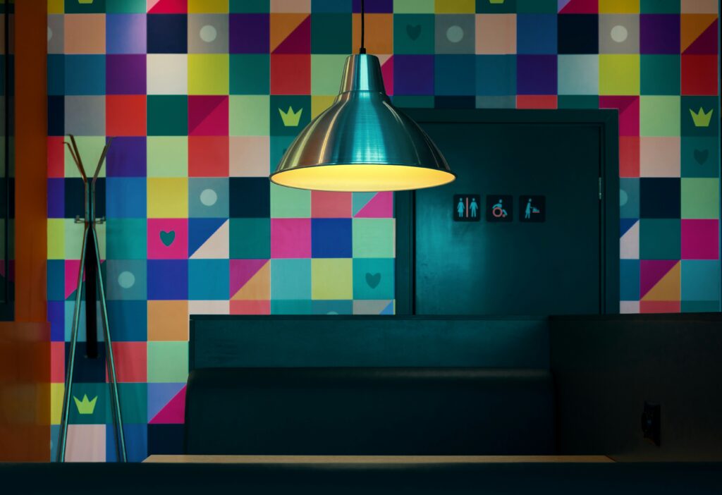
Mix Media for More Visual Interest
When it comes to pulling a space together, the right wall decor can make or break the room. While minimalist designs often rely on a clean palette and fewer objects, layering a variety of materials adds subtle complexity without feeling cluttered.
Combine Different Materials
One of the best ways to create visual depth is to mix different types of wall art:
- Canvas pieces for softness and texture
- Metal art for an industrial or modern touch
- Framed prints for a classic and structured element
- Sculptural pieces to add dimensional impact
Each material reflects light and space differently, helping to make the room feel more dynamic.
Use Textiles to Soften Hard Edges
Textile hangings offer a warm counterpoint to more rigid materials. Consider adding:
- Woven fabric art
- Quilted or embroidered pieces
- Lightweight tapestry-style decor
These not only soften the look of your space but also provide warmth and acoustic benefit.
Layering Adds Depth
Even in minimalist spaces, layering is key. Instead of placing one art piece on a blank wall, try grouping items:
- Pair a large canvas with smaller framed prints
- Lean a sculptural piece next to flat artwork on a shelf
- Overlap fabric hangings to break up solid wall areas
Careful layering lets you express personality without overwhelming simplicity. It adds nuance to minimalist spaces and helps your style evolve over time.
A good frame doesn’t just hold the shot—it supports the space. Matching the look of your frames to the room’s tone is one of those small details that change everything. Think matte black for clean, modern interiors. If your space leans warm and natural, go with wood finishes. A more classic, traditional vibe? Gold or antique brass fits the mood.
Just don’t get carried away mixing styles. Too many frame types in the same room can feel chaotic. Keep things simple and cohesive. Choosing two or three complementary finishes is usually enough to let your footage breathe without visual clutter.
Wall Art That Speaks to the Room
Choosing wall art isn’t just about blending with furniture. It’s about elevating the energy and expression of a space. In 2024, decorators are approaching wall art as a strategic design element that influences not just style, but feeling.
Set the Mood, Not Just the Color Scheme
While matching your artwork to the couch might seem like the easy route, it often misses the bigger opportunity. Art should set the tone of the room — whether it’s calm, bold, playful, or sophisticated.
- Use abstract forms for creative energy
- Choose soft tones for a calming effect
- Go bold with contrast and texture when aiming for drama or energy
Think Function, Emotion, and Balance
Every room has its purpose, and your art should reflect that.
- Function: A quiet piece may suit a workspace or bedroom, while a dynamic print can stimulate conversation in living areas
- Emotion: Consider how you want to feel in the room — peaceful, motivated, nostalgic?
- Balance: Vary sizes, shapes, and placement to avoid visual overload or underwhelm
Trust Your Gut — But Use a Tape Measure
Your instincts matter. If something speaks to you, it’s worth exploring. But don’t rely on feeling alone.
- Measure your wall space before buying
- Use painter’s tape to mock up gallery layouts
- Step back and evaluate spacing and scale before committing
Art should bring life into a room — not just fill empty wall space. When chosen with intention, it becomes the emotional anchor of a space.
Artwork tells people who you are before you ever say a word. A few travel photos or framed sketches from your last road trip can change the entire vibe of your space. Think custom prints from that artist you found online, or even family photos with a strong edit. The goal isn’t perfection—it’s personality.
Skip the off-the-rack art that feels like a waiting room. You want your space to feel personal, not staged. Even one carefully chosen piece in the right spot can anchor a room and give your vlog the flavor it’s missing.
And no, it doesn’t have to cost a lot. Print your photos on quality paper, repurpose an old frame, or support a small artist you follow. What matters is intention. Pick things you care about, and your audience will feel it.
 Irene Mooressit writes the kind of outdoor living ideas content that people actually send to each other. Not because it's flashy or controversial, but because it's the sort of thing where you read it and immediately think of three people who need to see it. Irene has a talent for identifying the questions that a lot of people have but haven't quite figured out how to articulate yet — and then answering them properly.
They covers a lot of ground: Outdoor Living Ideas, DIY Home Improvement Projects, Sustainable Home Practices, and plenty of adjacent territory that doesn't always get treated with the same seriousness. The consistency across all of it is a certain kind of respect for the reader. Irene doesn't assume people are stupid, and they doesn't assume they know everything either. They writes for someone who is genuinely trying to figure something out — because that's usually who's actually reading. That assumption shapes everything from how they structures an explanation to how much background they includes before getting to the point.
Beyond the practical stuff, there's something in Irene's writing that reflects a real investment in the subject — not performed enthusiasm, but the kind of sustained interest that produces insight over time. They has been paying attention to outdoor living ideas long enough that they notices things a more casual observer would miss. That depth shows up in the work in ways that are hard to fake.
Irene Mooressit writes the kind of outdoor living ideas content that people actually send to each other. Not because it's flashy or controversial, but because it's the sort of thing where you read it and immediately think of three people who need to see it. Irene has a talent for identifying the questions that a lot of people have but haven't quite figured out how to articulate yet — and then answering them properly.
They covers a lot of ground: Outdoor Living Ideas, DIY Home Improvement Projects, Sustainable Home Practices, and plenty of adjacent territory that doesn't always get treated with the same seriousness. The consistency across all of it is a certain kind of respect for the reader. Irene doesn't assume people are stupid, and they doesn't assume they know everything either. They writes for someone who is genuinely trying to figure something out — because that's usually who's actually reading. That assumption shapes everything from how they structures an explanation to how much background they includes before getting to the point.
Beyond the practical stuff, there's something in Irene's writing that reflects a real investment in the subject — not performed enthusiasm, but the kind of sustained interest that produces insight over time. They has been paying attention to outdoor living ideas long enough that they notices things a more casual observer would miss. That depth shows up in the work in ways that are hard to fake.